Part 2: Game Design: Level Design, Systems = Fun!
Howdy and welcome back for the second of 3 parts to this Showdown series! Picking up where we left off last week, we’re gonna be talking about level design and the game systems. We’ve been watching feedback on Showdown the past week and looks like there’s tons of y’all out there yee’n and haw’n. A few cowpokes have been asking why the map is small and why it isn’t symmetrical, and while we mentioned a bit of that in the first blog, we talk about that more in depth in this one!
Level Design:
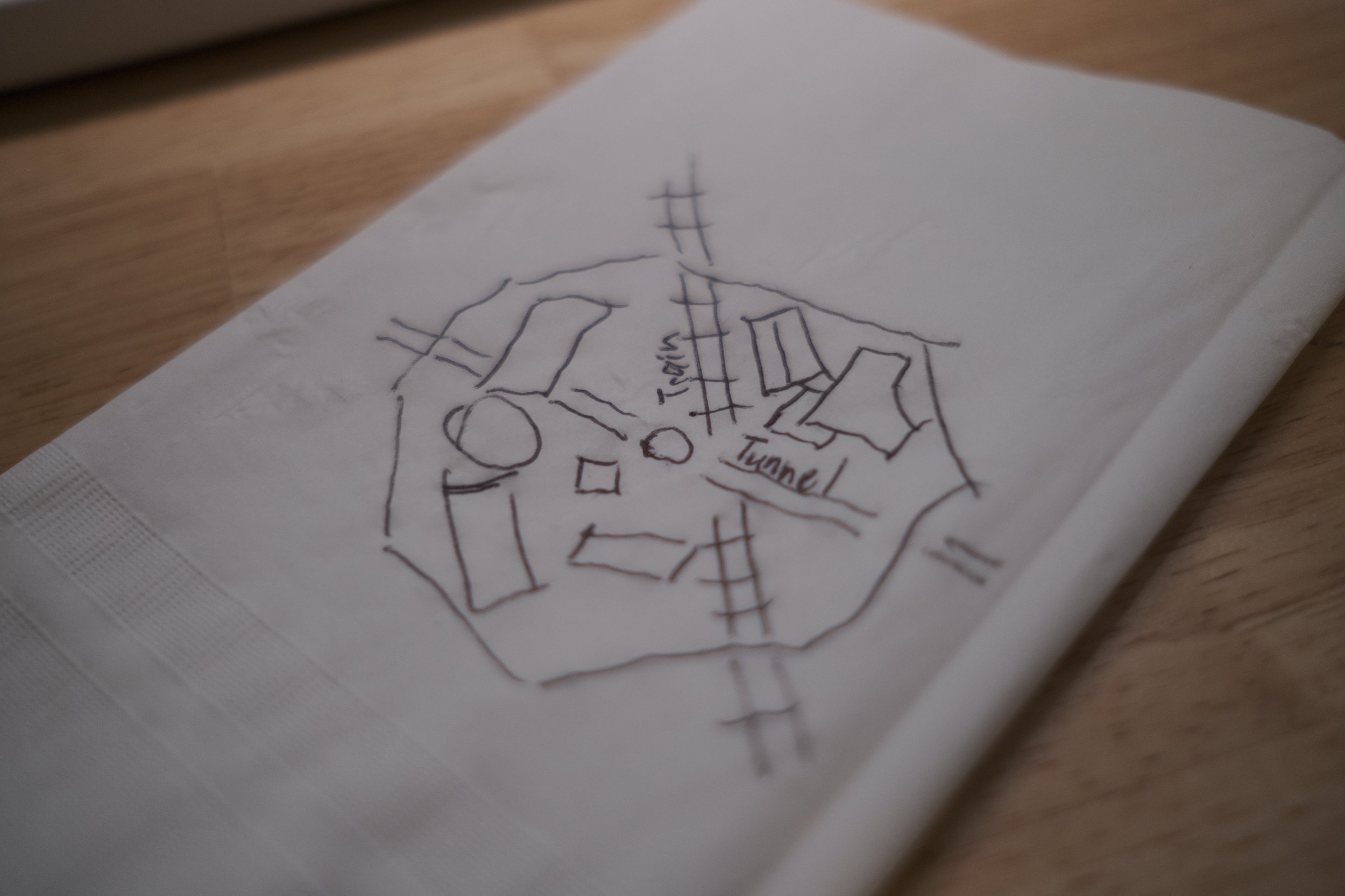
The town of Sasparilla Springs started off as a napkin sketch! As we began thinking about what ^Showdown would be we asked ourselves… what makes a good PvP map? How are we going to make something differentiated than our existing paintball and laser-tag maps that plays to the rock paper scissors concept of our weapon balancing?
The answer was to focus on team deathmatch exclusively over capture the flag. This opened up a few new avenues for us in the world of map mapping.
We didn’t need to make a ‘sided’ map anymore. Asymmetric design could be our friend rather than foe.
Approach avenues could be geared towards flanking and surprise over cover as you weren’t carrying a flag.
We also wanted to add a cool interrupt into the game pace with the train.
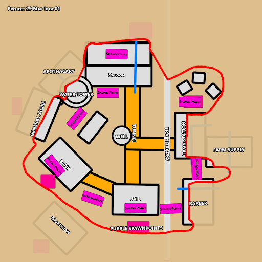
That napkin sketch quickly turned into an orthographic design which was refined a few times to bring down to a size that felt fast and furious.
A common inclination for map design is to go too big, especially for an arena shooter. We started a little too big with the map which wasn’t encouraging the speed and chaos we craved with Showdown. Games would take longer and the time to get a KO would be longer as well, so we shored up the perimeter and really focused on density. This led to shorter game times and we found players were hitting the 25 KO mark just around 4 minutes!
We knew that with the power of the makerpen we could quickly start getting a true feel for gameplay rather than designing on paper. Just a day or two into the project we were beyond paper and playing inside of our greybox map in Rec Room.
We quickly settled on a fairly cylindrical map with different, partially obstructed vertical layers. Players would be able to circumnavigate the map, but they’d need to either rise up or dip down through the 3 levels to do a full circumnavigation. We started to think carefully about cover and sightlines at this point as well.
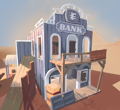
Sasparilla Springs is a series of 19th century mining town buildings, with accessible roofs, and tunnels below the town. We imagined a group of bandits escaping the jail, dynamiting their way into the bank, and escaping via train. This helped us frame where buildings might be placed relative to each other, and gave us a background for environmental storytelling as we built the map.
We also began to understand what weapons we’d be creating, and wanted the map to contain near, mid, and far combat zones to support our rock-paper-scissors style gameplay with the cork guns. This led us to carefully crafting our balconies and their sightlines so as to not overpower the center of the map with roof-top snipers. We also wanted to give revolver users a fighting chance in the tunnels and so a few longer underground sightlines means that it’s not always a sure win for shotgun users underground.
Oh and hey, we figured we’d throw in some dynamic cover with the train just to mix things up mid-game.
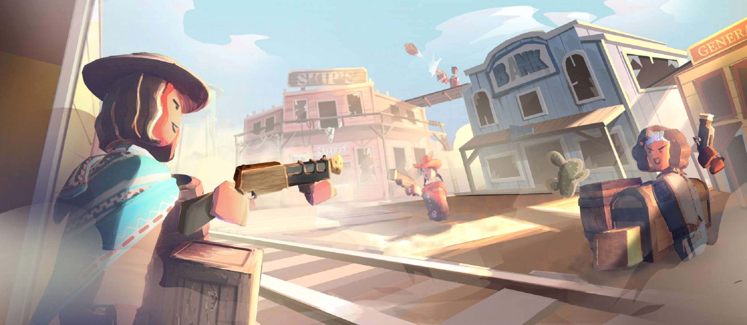
The collection of buildings, roofs, tunnels, and train lead to some really cool circular movement gameplay, where chaos can reign, and where organized teams can thrive if they work together, holding key buildings and angles on the map.
Even with an organized team holding watch over the center of town, competing players still have many avenues of approach and attack by moving through the buildings and tunnels to sneak up behind high-ground holders or sniping them from far away.
Game Systems:
We won’t go into too much detail in this post about the systems since we will when we talk more in a later blog post about circuits, but once we had the foundation for our game we could focus on other systems to make the full game work. The main systems we used are:
Game Manager - This was the main manager that told the game what state we were in. Pre Game, Intro Game, Game Start, Game End
Scoreboard System - Kept track of all Hits and Outs by player, tallied them up, and showed on the scoreboard. It also was added to our variables for the leaderboard stats.
Countdown timer System - Our 4 min timer that tracked how much of the game was left.
Costume System - Costumes that are added to the players at the Game Intro to differentiate teams.
Team System - The rest of the team system that splits all players into teams and notify what team you are on.
KO Systems - Before de-spawning we need to notify you that you have been hit and show the classic KO skull over your head.
Respawning Systems - Once you are KO’d this system drops your weapon, and de-spawns and respawns you to a new location with a fresh revolver in your hand.
Audio System - Maintains and keeps track of all the audio on the map and when it should be playing.
Train System - Controls the animation and Steam of the train coming onto the map
Weapon Systems - The ability to pick up, drop, and swap weapons. Also we made it so you couldn’t dual wield the weapons in this game.
UI Systems - All the buttons and visuals to tell the player information about the game. One cool new circuit allowed us to create an in-game HUD (Heads Up Display) To show Team hits, and the timer countdown while playing. No more having to look up at the scoreboard and getting hit!
Whew that’s a lot of systems! All of these systems working hard at once are what create a fun polished experience for the player to hop in and play ^Showdown with their friends! Even more is the thought and care put into each of these systems which we will talk about more in the next blog coming soon. Don’t miss it!
See ya real soon!


