This week we are covering a new feature in Rec Room, Content Showcase Posters! A tool now available in your Maker Pen, this is another step in helping creators better connect with their audiences and promote their content easily.
How does it work?
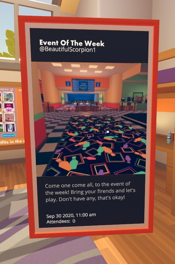
Target your poster to any public event
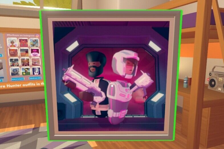
Target your poster to any published room
To create a poster, open your maker pen palette and spawn one from dynamic props.
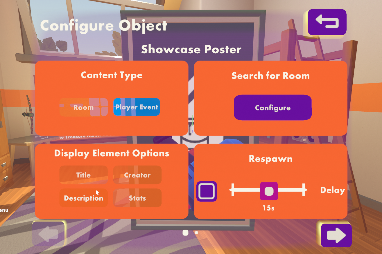
Select configure in your maker pen and click on the new poster. You have an option between Rooms and Events. Select whichever type you wish to display
The configure button lets you choose from a list of published rooms or events in the watch menu. Once you select your target, a default version of the poster is displayed with the room or event details.
To further customize your poster, toggle the various display elements and it will resize automatically
Title
Creator / Host
Description
Room Stats / Event Details
You can also recolor your frame to match the image on your poster! Choose a color, select recolor in the maker pen menu and click on the poster
What’s New?
The posters are similar to link buttons in their purpose, but involve no interaction by the audience. Creators can directly display their content that others can view with no extra action. What’s more, these posters can also be customized to determine the level of information that the creator wants to display! If the purpose is to showcase content quickly and aesthetically, these posters are a great tool. If the creator wants their audience to interact with the room or event, these posters can be combined with the link buttons nearby, making it easy for users to access the target.
The Process
With the dev blog, we like to give you a behind the scenes view of the process we went through to build our features. With the Showcase Posters, we wanted to give creators a highly visual way to promote their in-game content, with limited interaction by the audience. Additionally, we also wanted the creators to be able to choose what part of the content they want to display without having to worry about composition.
Dynamic Sizing
Accommodating the different poster variants was the biggest challenge. We couldn’t just create different sized posters as the variants were too many, and would only increase with each iteration. This gave rise to a 9 - slicing system for the poster’s 3D mesh.
The poster frame is divided into 9 parts. 4 corners, 4 edges and the backing.
To resize the poster, the edges and backing are scaled while the corners are just repositioned, to maintain the thickness of the frame.
Auto Composition
One of our goals was that creators shouldn’t spend any time doing composition. It would come automatically with the content they chose. The simple approach was to create different canvas layouts for each variant, but we soon discovered that creators might want more choice on the type of content they display. For this we created an automatic adjusting system for the canvas elements using Unity’s Vertical Layout Group component and disabled any UI element that was deselected by the creator. This allows the creator to have agency over all the UI elements in the poster in a quick way, while maintaining the poster format.
Description enabled
Description disabled
What’s Next?
Content Showcase Posters allow the creator to promote their in-game content in a far easier and more visual way than before, but this is still limited to Rooms and Events. In the future we plan to include other types of content that the posters can target as well as provide more aesthetic options, like image ratio or layout.
Let us know if you have any feedback in the comments. Have fun with the posters!


