Dev Blogs

Tee-rific Moderation Update

Once upon a time (summer of 2022), in a faraway land (the roomiverse), and long before Avatar Studio, we launched the Shirt Customizer. It was the first time players could customize clothing and the creativity the community has shown confirmed that when we give you the right tools, you make all kinds of cool stuff and a lot of it - we’ve seen millions and millions of shirts being created and sold. 

So why bring this up now, two years after the feature launched? Well, we’ve got a new feature we’re rolling out for custom shirt publishing and are long overdue for an explainer on how custom shirt moderation has been working behind the scenes. We also want to walk through how we’re applying what we’ve learned from Custom Shirts to our vision for Avatar Studio - so you can create and wear avatar items to be your favorite version of you, while still being fun and welcoming for everyone! 

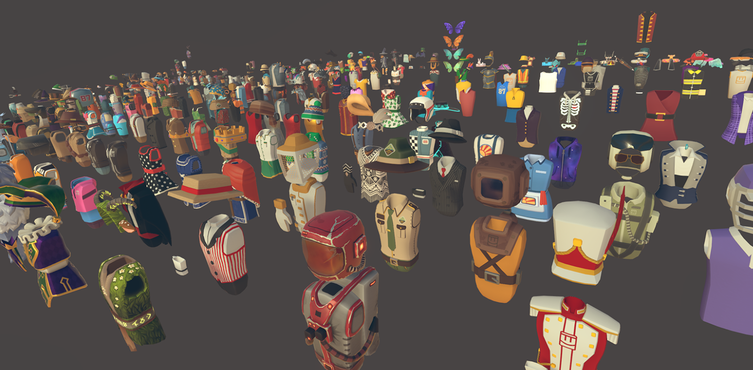
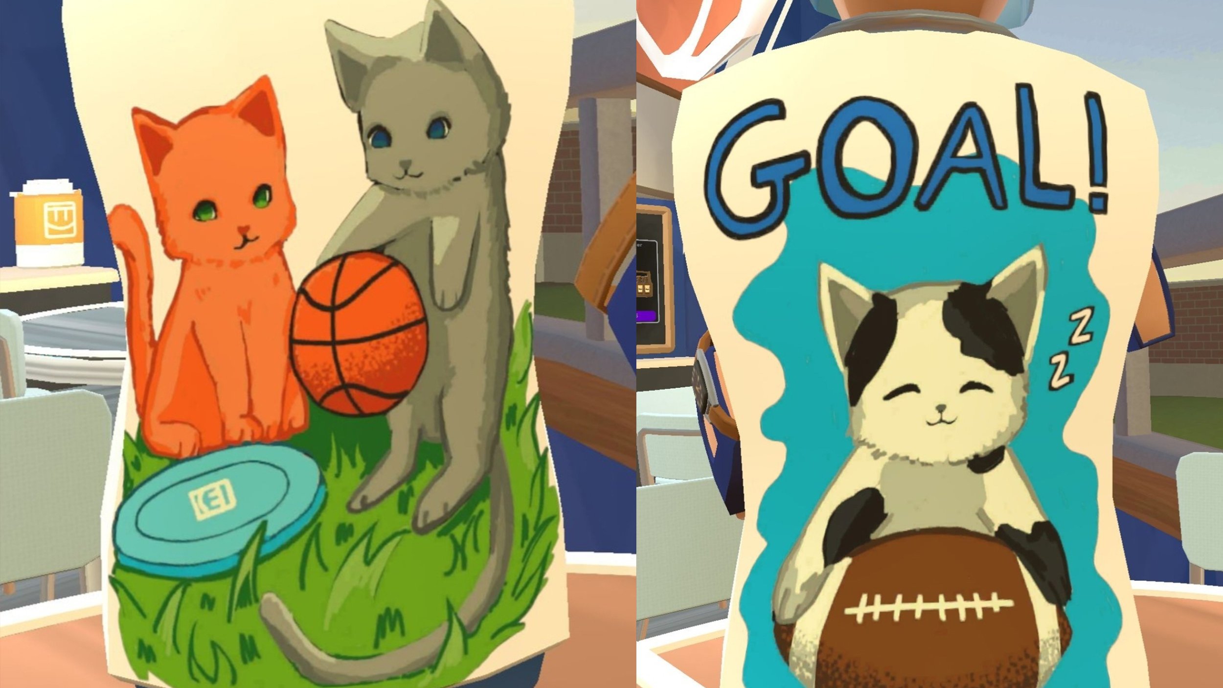
We’ve seen so much creativity come out in custom shirts, and it really got us thinking about the potential for UGC avatar items. Just look at some of these really fun examples!

We also saw some folks who wanted to push the boundaries and be a little provocative (you know who you are!). A few people really do go too far though, and we saw some customization that just wasn’t appropriate. We’re pretty sure you all know it, but to be clear, if it breaks the Creator Code of Conduct, then we won’t allow it.

We never want the small subset of rule breakers impacting the play or creation experience for the majority of players, so we put some great tools in place that help us detect inappropriate shirts within seconds of publishing. It works by scanning shirts for things that would be a no-go like nudity, hate, or drug content. It took us a while to get these systems fine-tuned, heightening and lowering thresholds for different categories and types of no-go content so that rule breakers had less chance of slipping through the cracks. And that system is now doing a pretty good job of making sure all your excellent creations get published ASAP and those handful of bad ‘uns don’t. 

If your shirt is detected as violating our CCoC, we take down the shirt so it doesn’t make it to the store. We operate on the premise of no harm, no foul - so creators get a warning with no ban because we want you to be able to continue creating great stuff. If our creation tools are repeatedly abused though, we may remove your shirt creation privileges - so consider this fair warning. 

When we were doing that fine tuning and decreased the thresholds for some of the Creator Code of Conduct categories, it got us thinking. What if the AI gets it wrong? How do we match up the automated rules with reality? This can be harder than it sounds as so much of these rules are about context and taste. Technically, if the AI does get it wrong, the risk to the creator is small because we just take down the shirt, but that wasn’t good enough for us. So, we’ve built in a new appeal system for shirts that are flagged by our AI systems. If you think the AI got it wrong and the shirt is not in violation of the CCoC, you can appeal and we will review it and reinstate it if it was a false flag. These appeals will even be used to fine-tune our systems and keep making them more accurate, so please use (but don’t abuse) this new function!

What happens when the AI doesn’t work the other way and something slips through that shouldn’t? Like always, you can report shirts you see that breach the CCoC and we’ll review and take action on those too. 

We’ve learned a lot of lessons enabling everyone to create the shirts they’ve dreamed of, and now those lessons are key to the development of our moderation systems for Avatar Studio. As you’ve seen, we’re taking it slow, building out and fine-tuning our automated scanning and appeal systems to match our CCoC, and planning out extra protections for avatar items that appear in high profile areas like our featured clothing. Keep an eye out for a future update that shares more detail on how we’re integrating trust and safety into the fundamentals of Avatar Studio AND creating tools with the potential for new clothing and accessory styles - Pumpkin Head and Sigma Headband anyone?

A Look Under the Hoodie - A Technical Deep Dive on Full Body Avatars

A Look Under the Hoodie - A Technical Deep Dive on Full Body Avatars

The full body avatar beta is now available for everyone! To celebrate, we wanted to share some of the nerdy details on how we made the full body avatar work and a refresher on why we did it. Jump to the end if you’re curious about what’s next…

Why we decided to make full body avatars

  1. More self-expression - One of the main reasons for introducing full body avatars in Rec Room is to create additional opportunities for players to express themselves. The classic bean avatars, while iconic, can sometimes be limited in conveying the widest possible range of emotions and actions. 

  2. Easier to understand what’s going on in the game - Our beloved beans are amazing, but sometimes it's a little hard to visually understand what they're doing outside the context of Rec Room. Full human silhouettes with connected limbs make it easier to understand visually what’s going on.

  3. Easier for creation - Soon, creators will be able to make their own avatar items to wear and share in Rec Room. Doing the work for the full body avatars allowed us to update the skeleton shared between beans and full body avatars to better match the industry standard so it's easier for our creators to make custom shirts, pants, hats, gloves, shoes, etc.

  4. Third-Person is better with full bodies - While controlling and watching your avatar in this improved third-person mode, gameplay and social interactions are just more fun with the full body.

  5. Adding new features we’ve wanted in our avatars - Adding new features like noses, adjustable glasses, adjustable body shapes, and eye gleams help breathe new expression into our avatars. These small details contribute to the overall relatability and expressiveness of the avatars, giving our players more options for how they want to look.

  6. Adds more ways for all of us to make money - By adding noses, eyebrows, fingers, arms, legs, and feet, we are expanding the kinds of things we and eventually our creators can make and sell to our community.

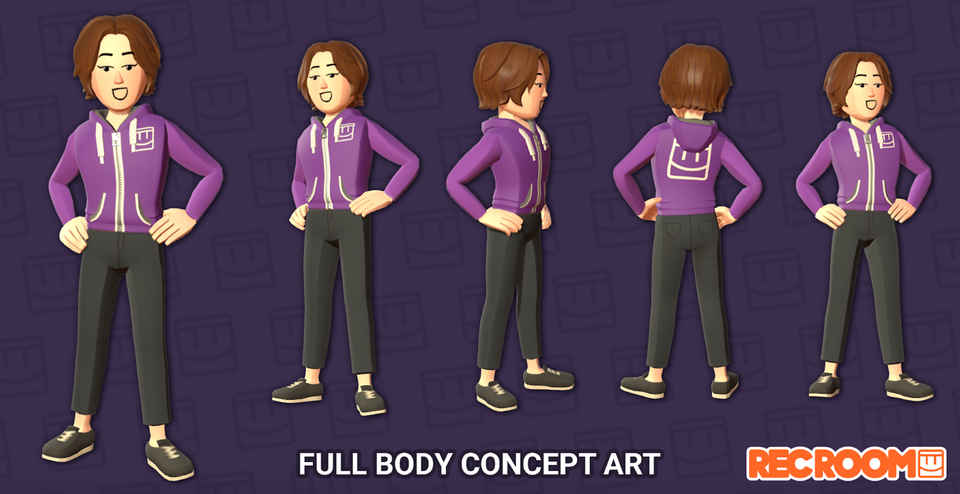
This was the initial concept art we created as a target for what full body avatars could look like. We’ve made a lot of tweaks and improvements since then, but we feel like the original charm remains.


Fitting more limbs into the same amount of memory

While we were developing the full body avatar, we recognized that our crash rate due to memory for all of Rec Room, especially on mobile devices, had gotten really bad. Every developer at the company was tasked with making memory optimization their top priority. One of the challenges that made it difficult to ship full body avatars within our original timeline is that we decided we needed to get to a place where the full body avatar, with all of their extra limbs, animation systems, etc., had to use the same (or less) memory as the floating bean. We called this “getting to memory neutral.” 

Here’s where we were when we started the optimization work.

Our benchmark floating bean avatar had 6,095 vertices (which define the geometry), and cost about 4 MB per avatar (which includes all 3 levels of detail meshes). The floating bean also had a total of 18 bones and 4 weights per vertex.

This is the benchmark avatar we used for comparison of our bean geometry cost vs our full body cost

The equivalent full body avatar (which added default pants and shoes) had 11,384 vertices, and cost about 8 MB per avatar before optimization. The full body skeleton currently contains 102 active bones with 4 bone weights per vertex.

We needed to find a way to cut our full body avatar cost in half in order to hit our goal of being “memory neutral.”

We got there with 3 key innovations.

Memory Optimization Innovation #1: Skin Culling Masks

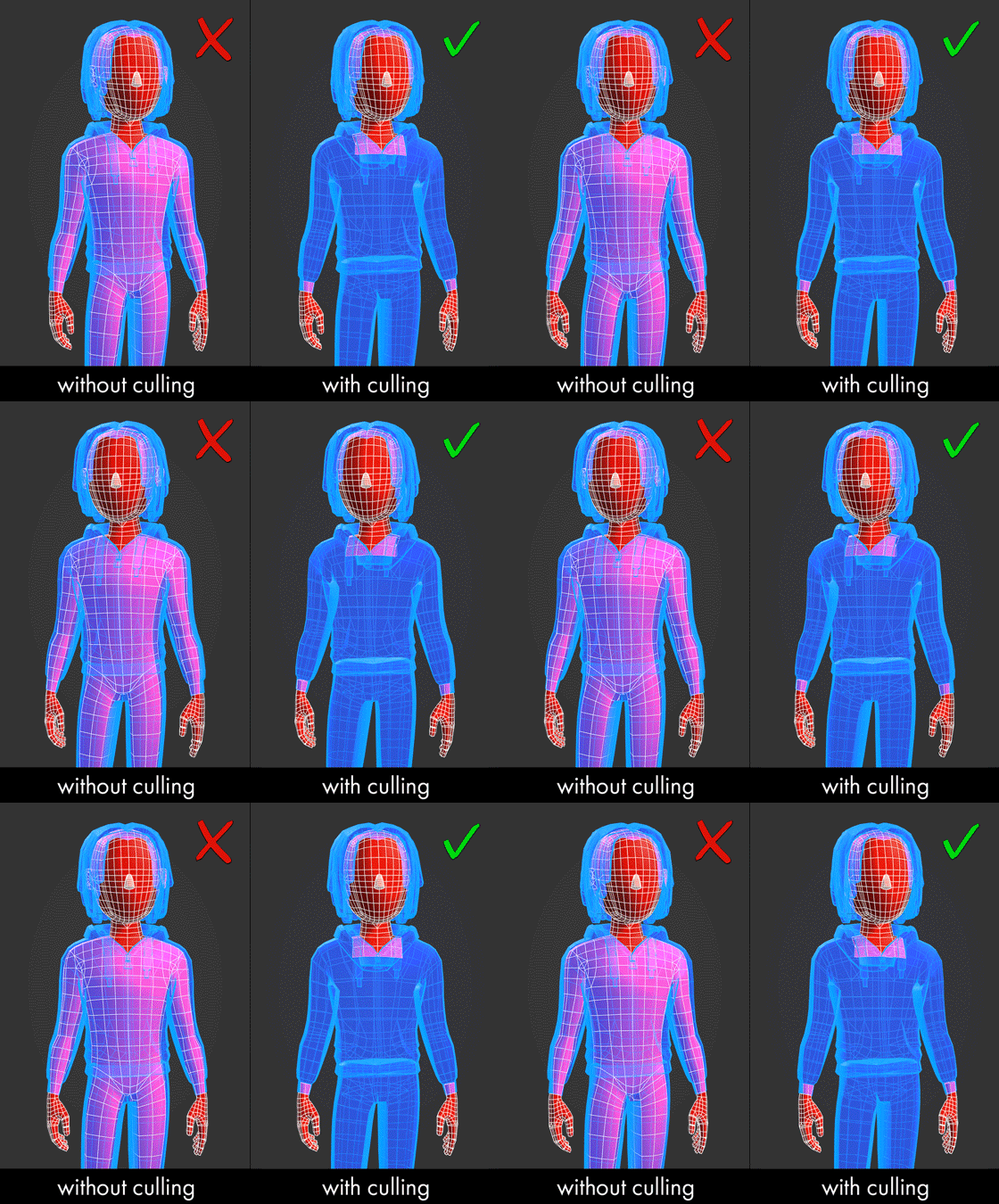
For our first innovation, we built skin culling masks. This technique allows us to throw away some of those expensive vertices in memory by not building parts of the avatar’s skin that are not visible based on what they’re wearing. This means that for every clothing item our artists and creators will author, they can select from a set of existing “skin culling masks” to inform the avatar system which skin faces are hidden when an item is worn. 

Whenever you change what you’re wearing, we look through the set of items you’ve equipped and determine which geometry faces can be completely discarded. This comes with the added benefit of avoiding clipping bugs by just removing the problematic underlying skin! 

You’ve probably noticed during our beta that when authoring our huge catalog of avatar items, some culling masks weren’t set correctly, or needed to be adjusted.  While we fixed many neck and wrist gaps, missing fingers and hands there’s still work to do. We are continuing to clean this up during our polish work.

You can see here in the right image that there are fewer skin polygons under the clothes compared to the left image that doesn’t have skin culling turned on. The Skin Culling technique allowed us to throw away between 1k to 2k vertices on average.

Memory Optimization Innovation #2: MeshData, and Vertex Data Compression

For our second innovation, we re-wrote how the avatar mesh was built using a new primitive called the MeshData feature. This dramatically sped up how our avatars are built, and removed an annoying frame hitch that sometimes happened. 

Before, you’d probably notice when a player joins a room there can be a few frames of lag, especially on lower-powered devices like the Quest 2. That’s no longer the case with full body avatars. 

Another nice thing about the MeshData feature is that it allowed us to compress the data per vertex so we could manipulate how much memory that bone weights and UVs took up. With this optimization, we saved about 30% of our total memory.

This is a snapshot from deep within our code of how we changed the layout of our vertex data to trade precision for memory efficiency (using half and byte data types instead of floats and integers saved us 60% of our unvarying data)

Memory Optimization Innovation #3: Just-in-Time Level of Detail

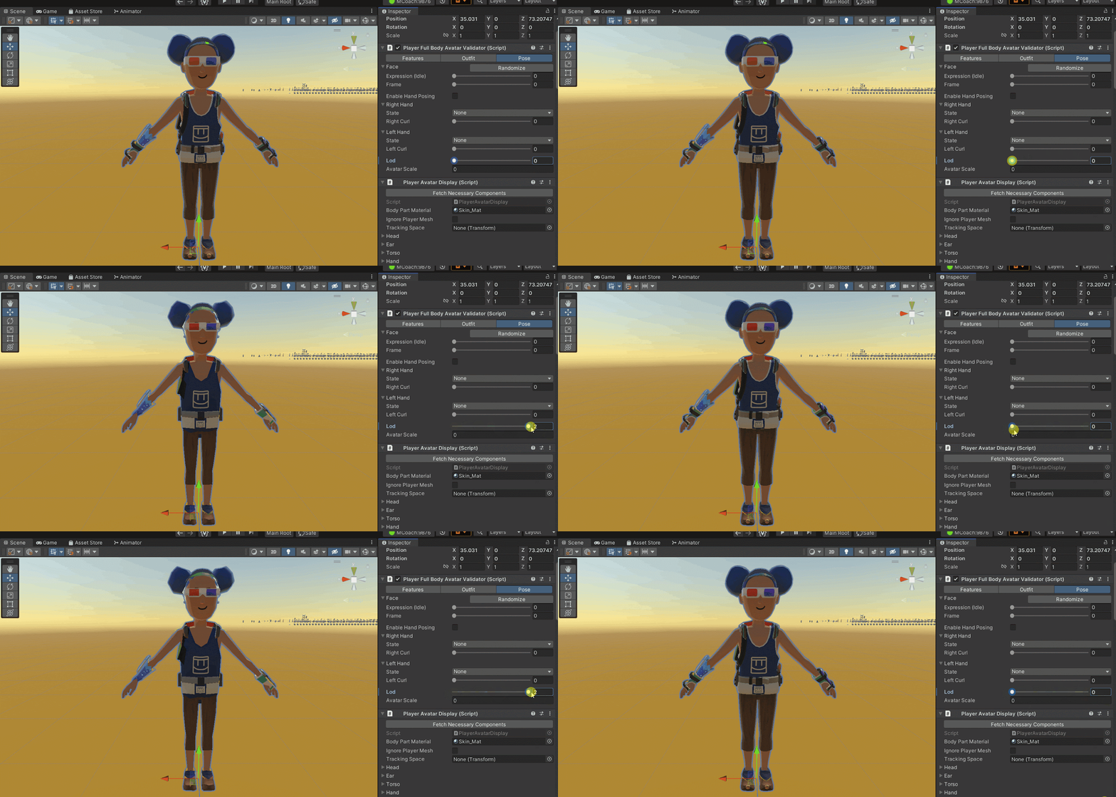
For our third and final innovation, we developed a technique we call just-in-time level of detail. The classic floating bean system builds all three level of detail meshes whenever a new avatar appears and holds on to them in memory. We then only show one of these meshes at a time based on how far that player is from your camera.

Showing the different level of details that an avatar may have

Because of the work we did to use the MeshData type above, we could explore building a dynamic avatar that builds the avatar when the level of detail should change without experiencing those frame lags. So now we only pay the memory for what we display. This saved us another 40% of memory on average. 

This trades off some compute time for memory savings, but we found across all of our platforms that thanks to Unity’s MeshData and multithreaded Jobs, it does not impact FPS!

So in total, we were able to reduce the cost of the full body avatar by around 60~70%, more than the 50% we needed. This is why we say that the full body avatar is more optimized than the floating bean.

Memory problem solved! What about the frame rate?
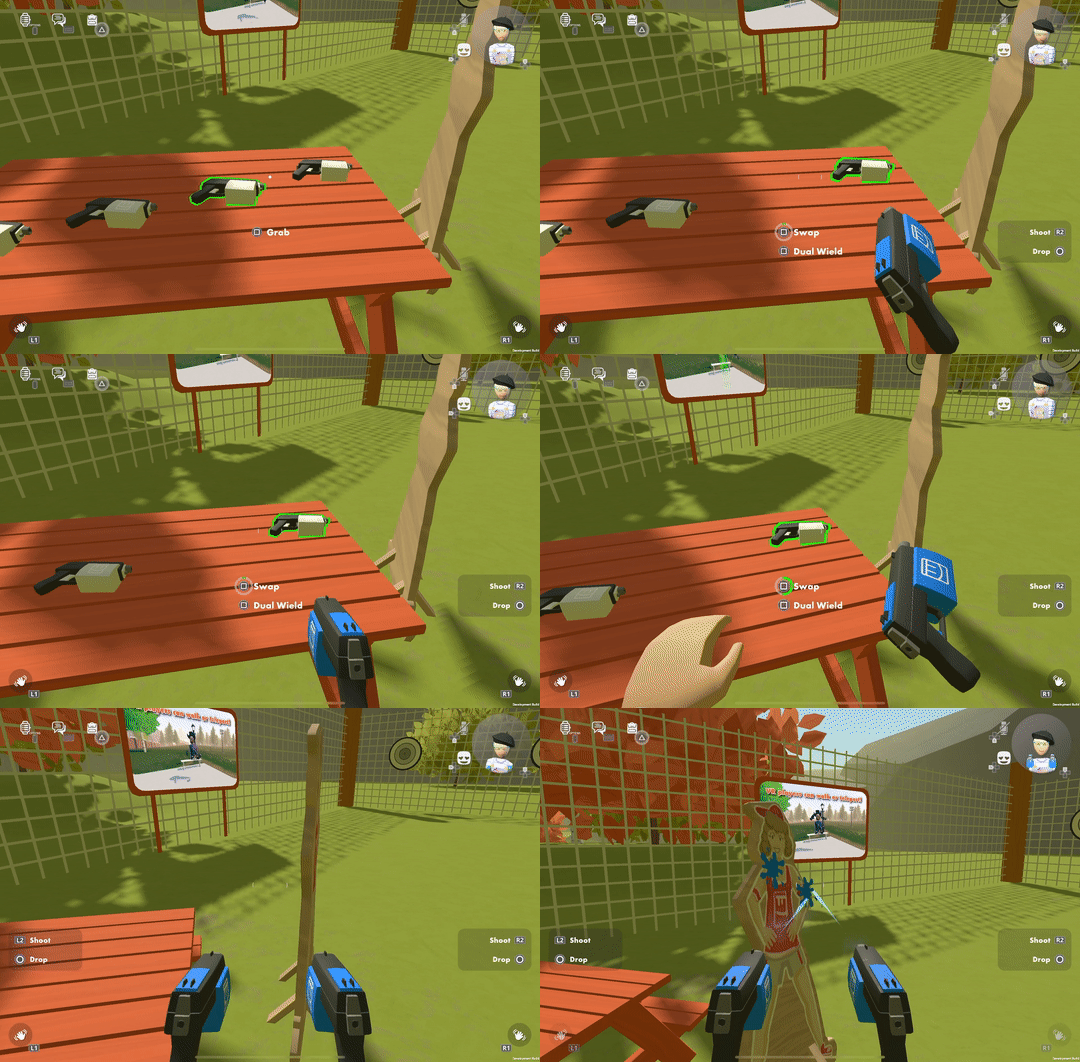
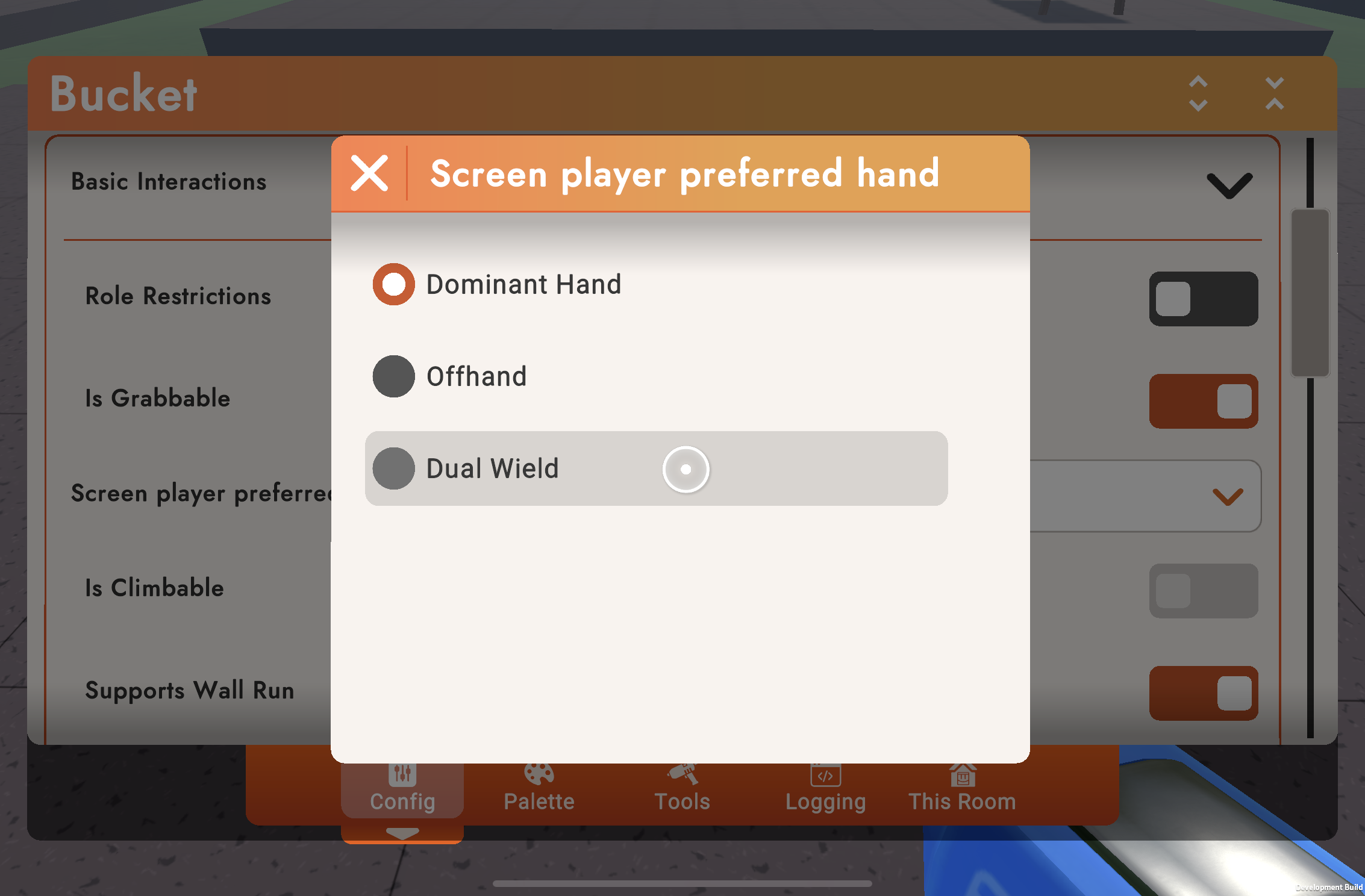
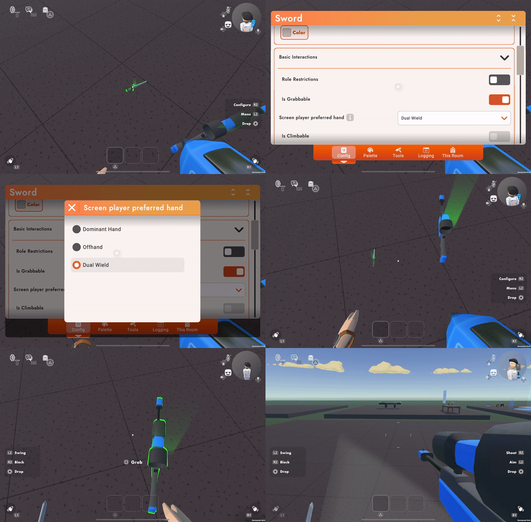
Thanks to Unity’s animation system, we found that all of our platforms could pretty smoothly handle the complexity of the extra limbs. Where we did add some considerable computational expense is in the full body inverse kinematic (IK) solver we use. 

Full body IK helps with the believable movements of the body, arms, and legs on screens and in VR while only tracking or animating your head and hands. With enough players in a room, lower-end platforms started to show bad FPS. So instead of updating the full body IK solver for every player on every frame, we built a system to dynamically update player animations up to a certain amount per frame, prioritizing those avatars closest to the player or those that haven't been updated in a few frames. 

This priority-sorted technique ensures that you always get a good FPS, but at the cost of some players’ movement stuttering a bit, especially when they are far away from your camera. This felt like the right trade-off for us.


Interaction Improvements: Showing your hands while grabbing stuff


One of the big challenges for full body avatars was coming up with a way to show you grabbing objects. With the floating bean, we got away with this by hiding your hand whenever you were holding something. But since one of our major goals was to make it easier for others to understand what you were doing, we knew we needed to find a good solution for making sure holding items looked good.

We tried a bunch of different approaches, including snapping your virtual hand to a spot on the grabbed item. But that felt like the game was physically pulling you around and rotating your hand. We decided that we should always honor where your hand is in real space and have the grabbed objects come to them, so your virtual hand feels as close as possible to your real one. You can especially feel how this improves the stabilizing handles for laser weapons while in VR. 


We did find one exception to the rule that felt nice. Instead of allowing your avatar arms to stretch as long as they need to match the location of your real hand, there’s a point where if you move a held item too far, your hand will look like it let go and the tool hovers where you’re holding it in real space…kind of like you’re still controlling it with magical powers. We call it the “Telekinesis effect.” 

The telekinesis effect

Then there’s the visual gripping effect for (many) objects. We wanted the visual to look cohesive for Rec Room objects. In order to give our artists control over how hands are posed when grabbing the object, we created an internal tool called the Hand Grip Placer. Our Artists can then determine how objects should sit in the hand and what hand pose they should take. During the beta period of full body avatars, we are continuing to work through all of the 500+ items you can grab in Rec Room to make sure that you have great-looking grips.

This is an internal tool we wrote to give our Grip Artists a way to place and pose how the hand should grab each one of our 500+ items in the game.

Improved movement & animation

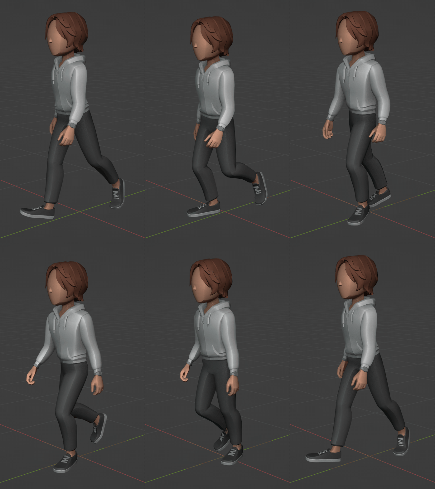
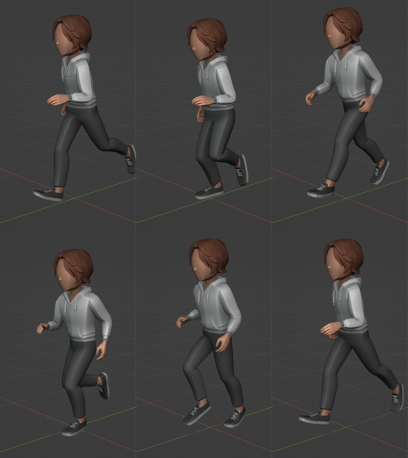
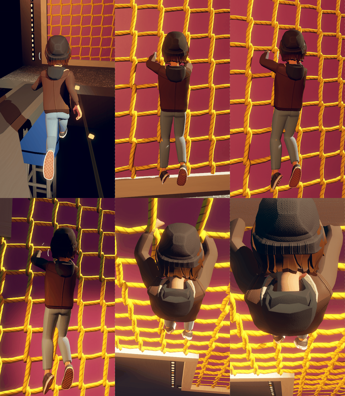
Thanks to the work of @joedanimation , we have enhanced and added more life to our avatar animations. This includes improvements in walking, running, jumping, climbing, clambering, wall running, and sliding. Our goal is that Rec Room feels immersive and expressive, and these improved animations do a lot to ground the avatars in the reality of the game space. 

We are still working on polishing all of the animations in the game as part of our beta work.

Bean slide compared to full body slide


Full body avatars is still in beta, so what are we working on to get it out of beta?

We are continuously iterating on the full body avatar, and now that every player can use them, we are interested in hearing and working on feedback from everyone. 

We are continuing to work on how the full body avatar moves in VR and screens (especially with dancing and idle animations), fixing holotars to work with full body, making it so a creator can determine which avatar types are used in their costumes, fixing the ability to adjust how hats sit on your head, fixing more screen-based animations (have you noticed how full body avatars drink water bottles through their eye? :P), finishing up all of the grip poses for the 500+ items, and exposing the underlying sliders that shape your body and head so you can have more control in customizing your form.

We are also continuing to polish some of our legacy avatar items that don’t look great yet on the full body avatars (we know some gloves aren’t where we’d like them yet). Finally, we haven’t forgotten about full body tracking and finger tracking for our VR players.

Only when this list of things are done (and we address additional feedback we receive) will we consider dropping the beta status. 

Our commitment to the floating bean avatars

We know a lot of you are concerned that we may deprecate the floating bean avatar when we determine full body avatars are ready to be out of beta. Don’t worry! We are committed to supporting and upgrading floating beans that have been here since the beginning of Rec Room. 

One of our big tasks right now is to take the optimizations that you read about above— such as skin culling masks and just-in-time level of detail— and bring them to the bean so we can reduce their cost by 60%. This will be a big help in our fight to improve performance on all platforms. 

Additionally, we plan to bring over some new features to the bean like being able to see your customized hands when grabbing objects, being able to see your torso when you look down, and the option to have a nose, the option to have eyebrows, and the option for eye gleam. Whether you want to preserve your classic bean as is, selectively add some of the improvements (such as eye gleam, or eyebrows), or move all the way to a full body avatar - we will fully support you.

Look out for an upcoming dev blog where we will dive deeper into our plans for preserving and enhancing the floating bean avatars.

With the upgraded bean (coming soon™) , your glove customization can stay visible when holding items like the laser pistol. We’ll also have an option to hide your hand if that’s the interaction you prefer.


State of Voice Moderation

The State of Voice Moderation

We've received a lot of questions about voice moderation, so we got the 411 from our trust and safety team on how voice moderation actually works in Rec Room.

We use voice moderation systems in all public rooms in real time. These are cutting-edge machine learning systems that detect hate, harassment, and other types of nasty speech based on Rec Room’s community standards.


What’s The Deal?
We’ve spent the last year running analyses and reworking our systems. Here’s the most important takeaway: the data confirms what we knew all along - the vast majority of players are fantastic community members. Most have never broken the Code of Conduct. Never. Not once. Angels.

Of those that have broken the rules, most players only slip up once. Say it gets a bit tense, maybe you miss *that* paintball shot at the last second and a few “$%@!s” slip out - our voice moderation system is designed for exactly this. It will catch the one-off and give you a friendly warning - because we get it - we all get caught up in the moment from time to time.

What If It’s Not Just A Moment Then?

Players only lose mic privileges if that moment escalates. Temporarily revoking mic privileges is a very direct form of feedback - hey, that wasn't cool! - but it’s also a chance to reflect; "how can I be excellent with other Rec Roomers when I get my mic back?"

If a player keeps using speech to be hateful or harass, that mic restriction will increase, and may eventually turn into a ban to give them a chance to cool off. We don’t like banning players. We do it when we have no other way to protect the experience for the rest of our community.

As we said, our players are top notch. So, bans for voice chat toxicity are actually really rare- like 1 in 135,000 people rare. You’re literally more likely to roll all sixes on six dice! And those very rare bans are now also short - we don’t need to (and we aren’t) pressing the 40-year ban button or even the one week ban button for voice toxicity. Long or permanent bans are used only for serious code of conduct violations.


But What If I Didn’t Actually Mess Up?!

Hang on though… you’ve all seen the social posts that say “I didn’t say anything and then I got banned” or one of our favorites “It was just a mic echo”. But it’s not true! If players are getting banned or muted, we are pretty dang sure they said a few things they shouldn’t have. Is it 100% perfect? No. But it almost is…

This is where our internal data wizards - come in: every detection system has a False Discovery Rate (FDR) i.e. a chance of being wrong. The FDR limits the confidence we’re making the right decision on any issue. If the FDR is ever above 5%, you can never reach 99% confidence. Unless… you wait. If you see not 1, but 2 or 3, or even 25 potential-rule-breaks in any given period - then you can have quite a bit more confidence that someone did cross the line.

So even if the system has a 5% FDR, if we see a player caught 10x, then we’re not 95% confident - we’re more like 99.999999999% confident. So yeah…almost 100% perfect! We don’t want to interrupt games unnecessarily, so to reduce false positives, we don’t ban or mute based on one thing a player says in one fragment of speech - instead we wait until we hit that 99.999999999% confidence rating based on multiple hits, which can be over a few sessions or in the moment.

This really is the best of both worlds - we catch the worst toxicity, we forgive the one-offs, and we stop those gnarly false positives. And you know what? It works! This chart shows what’s been going on over the last year - instances of toxic voice chat have fallen by around 70%!


What’s Next??

So, job done then? Not quite…we’re getting to a good place on improving the systems’ accuracy, but accuracy is only half the story. The other half is about what we catch - and more importantly, what we don’t. Right now, if the system is catching you, you slipped up more than a few times. But we know - and you know - that there are times we probably should have caught something and we didn’t. Players being unfairly banned is lose-lose, so we worked on accuracy - but now we’re turning our attention to broader coverage. More on that in future updates, but for now, thank you to all of you who continue to make Rec Room the great community we want it to be. And keep doing your Rec Room Best!

Fractura - A Research Project: Exploring Generative AI in Rec Room Creation

Introduction

Fractura is a room where we explored extensive use of Generative AI (GenAI) tools in the Rec Room creation workflow.

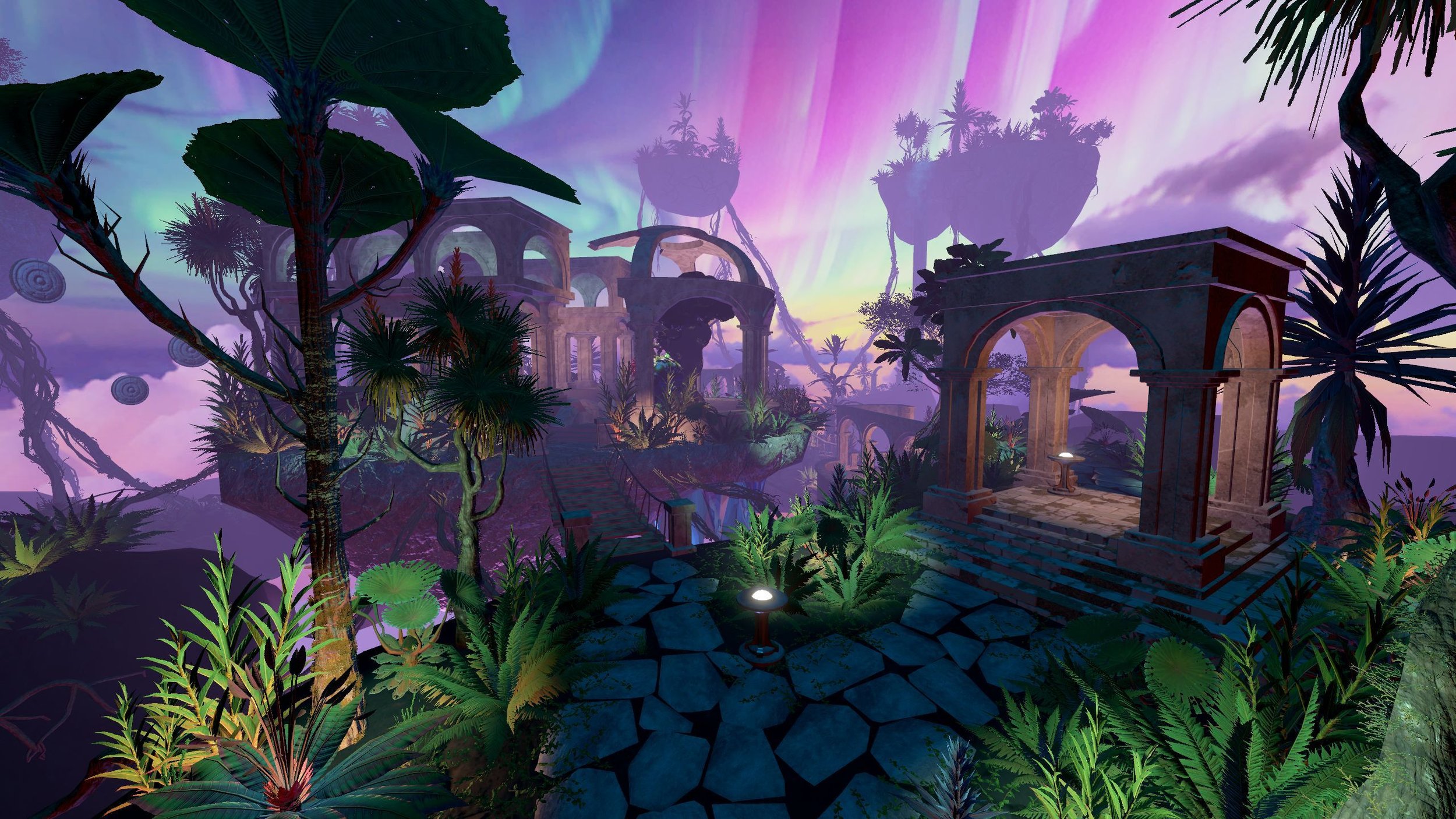
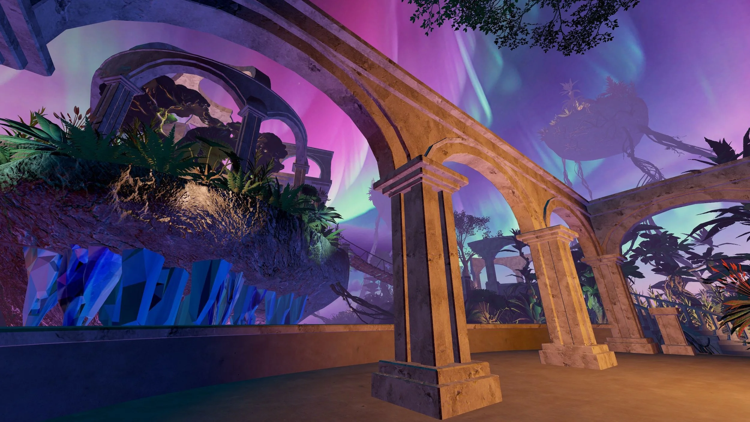
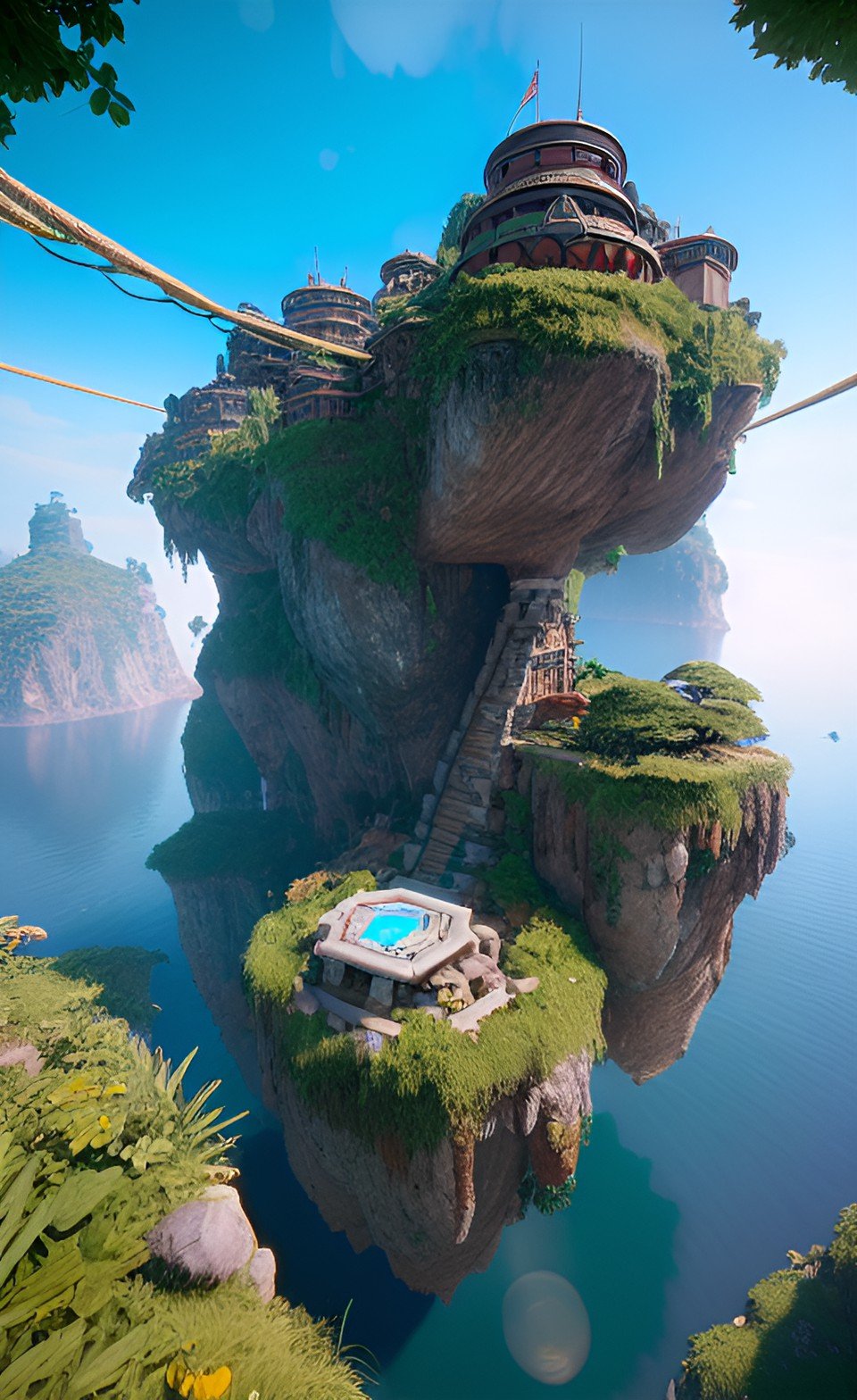
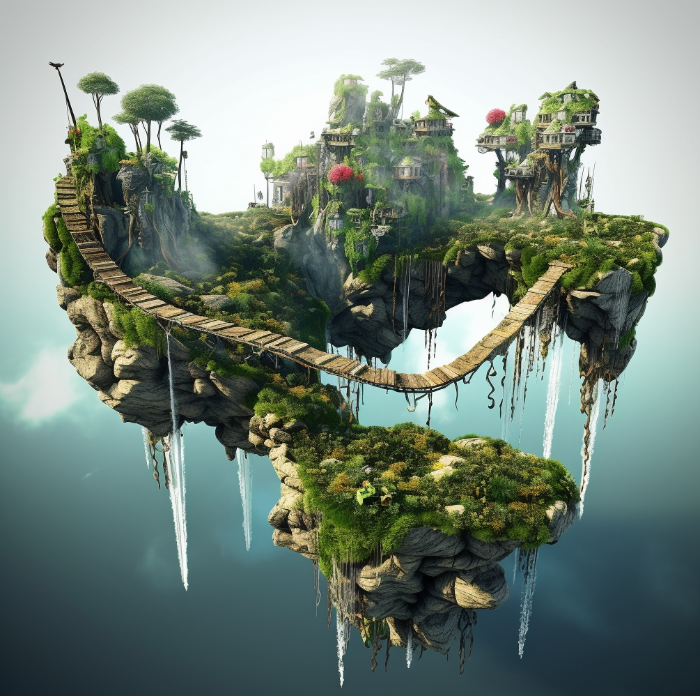
The result was the creation of an immersive alien world brimming with ancient mysteries!

Rec Room’s in-house Creative Team took a broad and experimental approach, evaluating over 20 different GenAI tools to identify which had the most potential to benefit Rec Room’s creative community. Since Rec Room Studio is built on top of Unity 3D, all of the GenAI tools mentioned in this doc and others can be used by any Rec Room creator today.

Concept Phase

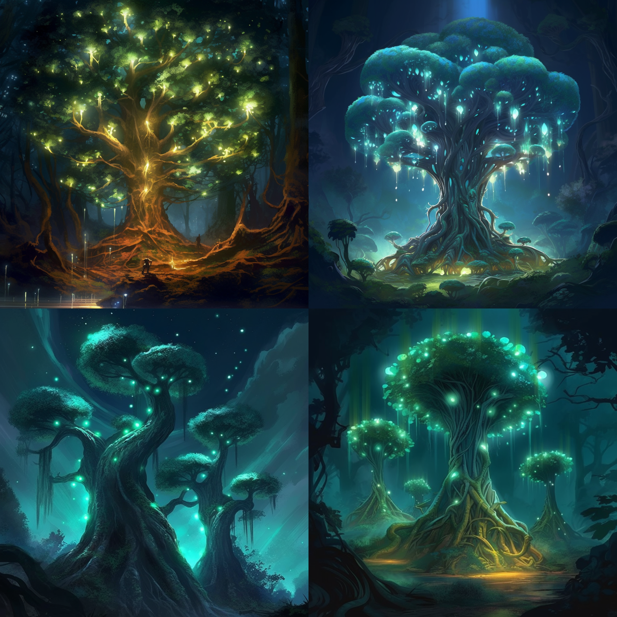
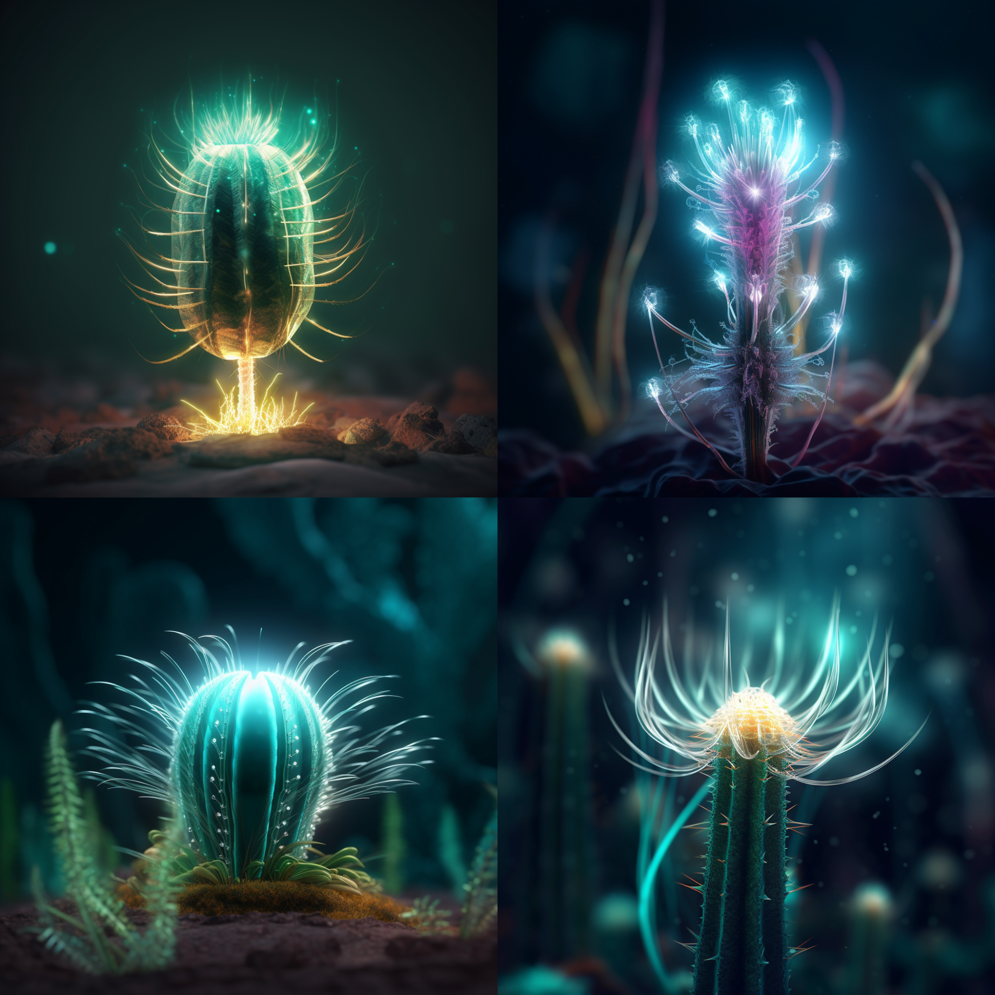
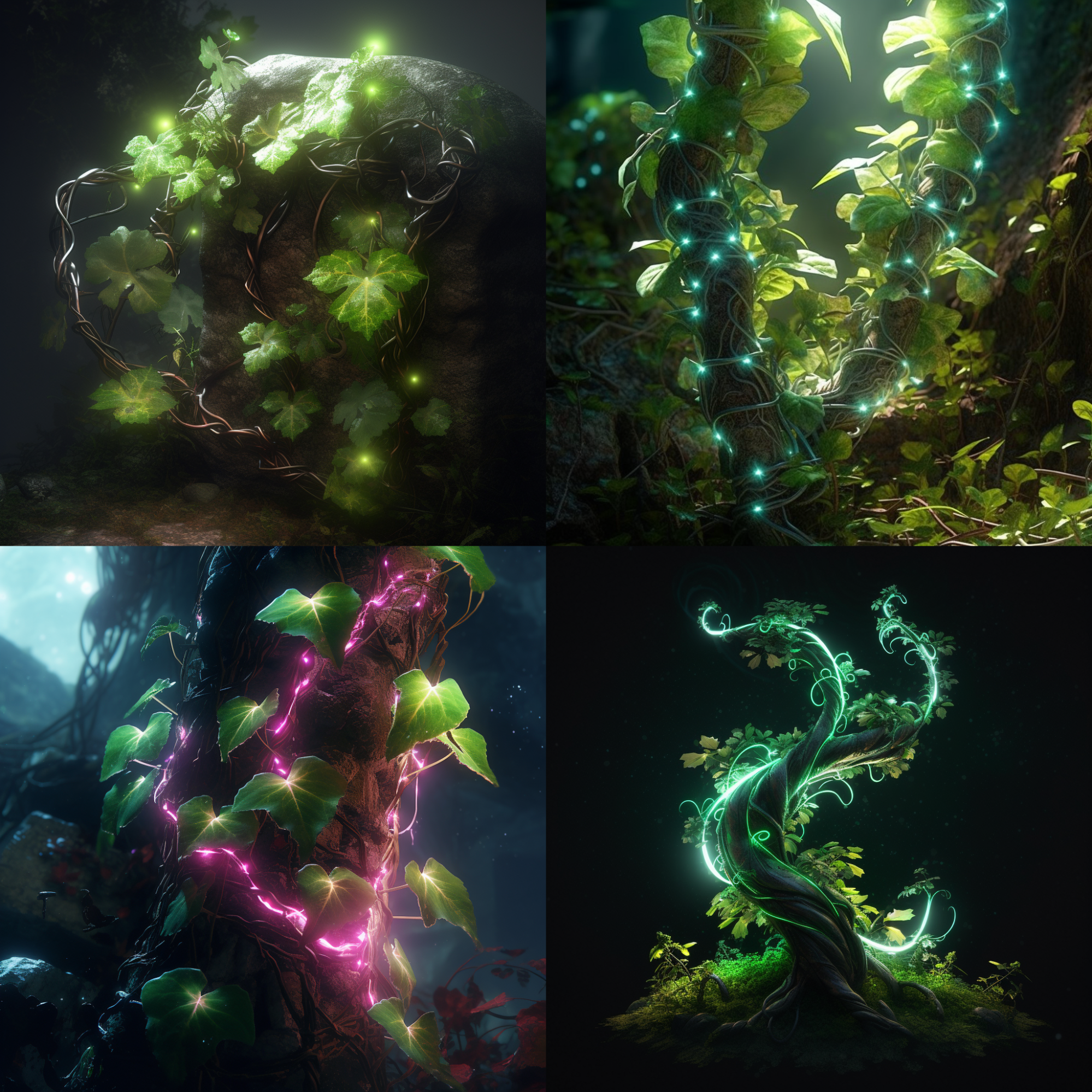
The use of GenAI started in the concept phase - the team used ChatGPT to develop the ideas behind Fractura, iterating through many prompts. The team explored ideas for landscapes, flora, and lore to flesh out the concept.

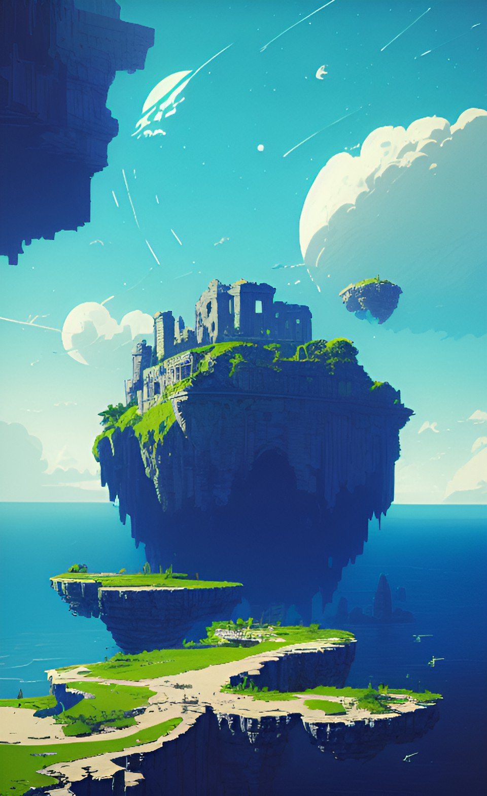
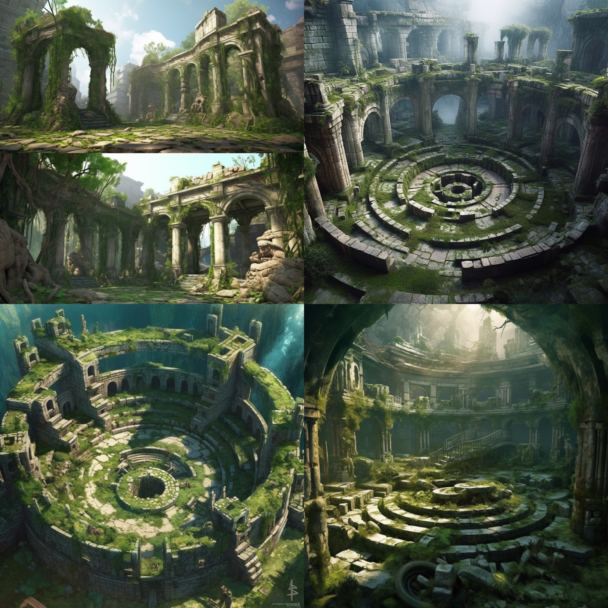
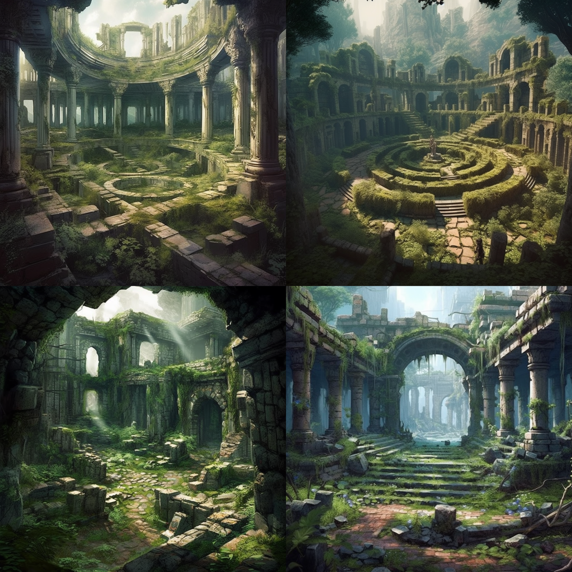
These ideas were then visualized using Midjourney and Dall-E. Fed by the text output of ChatGPT, these AI image generators created striking visual concepts.

This process was iterative, with the team using each round as inspiration to refine the ideas and shape Fractura’s identity and aesthetic.

If you want to see “behind the scenes”, here are detailed logs of what the concepting phase looked like:

ChatGPT Prompt Log

Midjourney and Dal-E Generated Concepts

Skyboxes

In video games, a “skybox” is an immersive texture that makes the environment seem larger than it really is. Creating convincing skyboxes is a difficult task that requires artists to create tricky “spherical” textures.

For Fractura, the team used Skybox AI by Blockade Labs. Skybox AI allowed the team to quickly generate skyboxes with the right kind of ethereal ambiance by entering text prompts based on the output of the concept phase.

The ease of generation allowed the team to create multiple skyboxes that players can choose from dynamically in the world of Fractura.

3D Asset Generation

GenAI was also used to generate 3D assets. Tools like CSM, Shap-E, and others had pros and cons. These tools were used to create trees, ancient stone robots, floating land masses, and distant buildings, instilling Fractura with an otherworldly allure.

However, optimization and performance challenges were commonplace. The assets generated often had very high polygon counts, requiring manual simplification and optimization so they could be used successfully in Rec Room Studio. Generation times were also often quite lengthy.

Despite some challenges, the future for 3D GenAI looks bright, and the team looks forward to further explorations!

Texture Creation and Soundscape

The team used Withpoly.com for texture creation and MusicGen for the soundscape.

Withpoly.com facilitated the rapid generation of textures and normal maps, allowing the team to integrate detailed textures into the game's environment and architectural elements. Since it was quick and easy to iterate on textures and normal maps, the team found they could use this tool to get just the kind of “otherworldly allure” they were going for.

When it came to the soundscape, MusicGen really delivered. This AI-powered music generator helped create a soundscape tailored to Fractura's alien landscape. The tool's ability to synthesize otherworldly tones, evocative melodies, and ambient soundscapes helped instill Fractura with captivating and immersive audio.

Want to listen to Fractura’s soundscape? Fractura’s Soundscape

Ideation and Interactive Elements

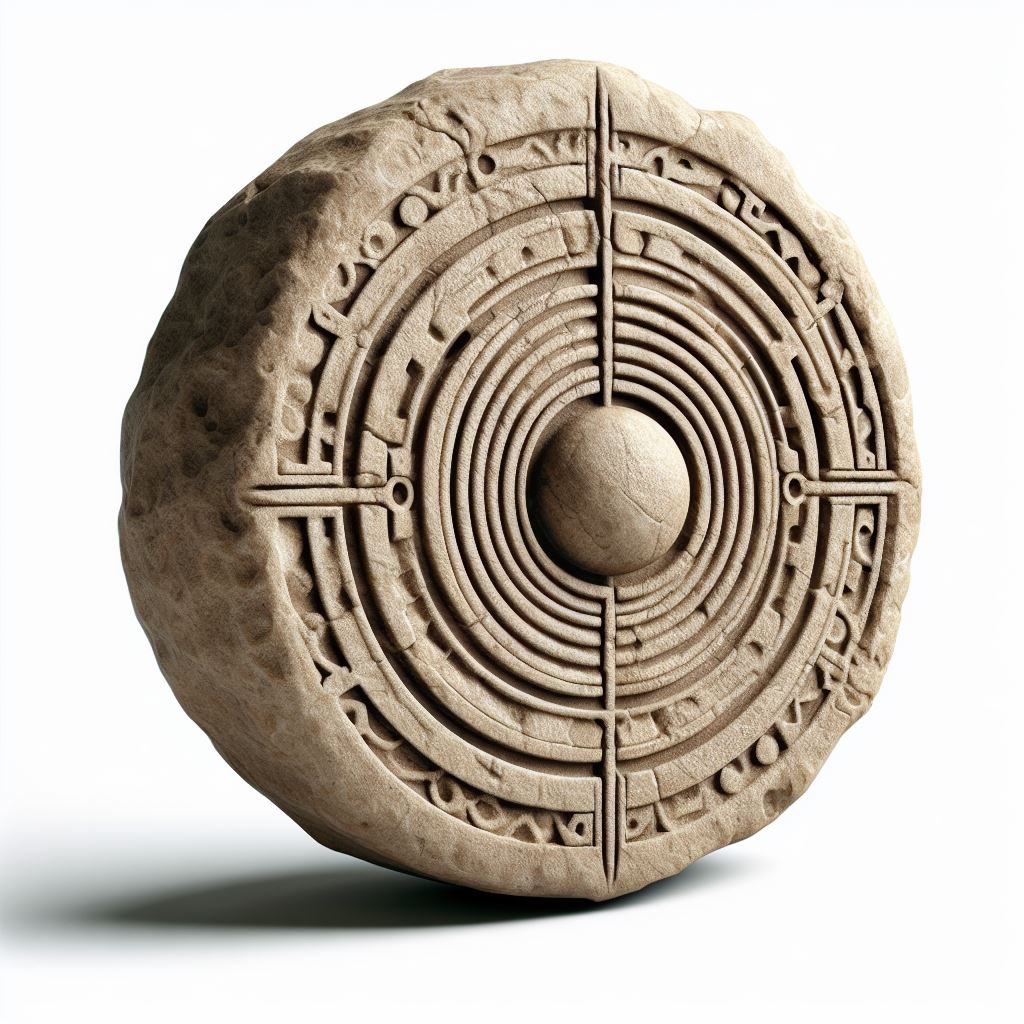
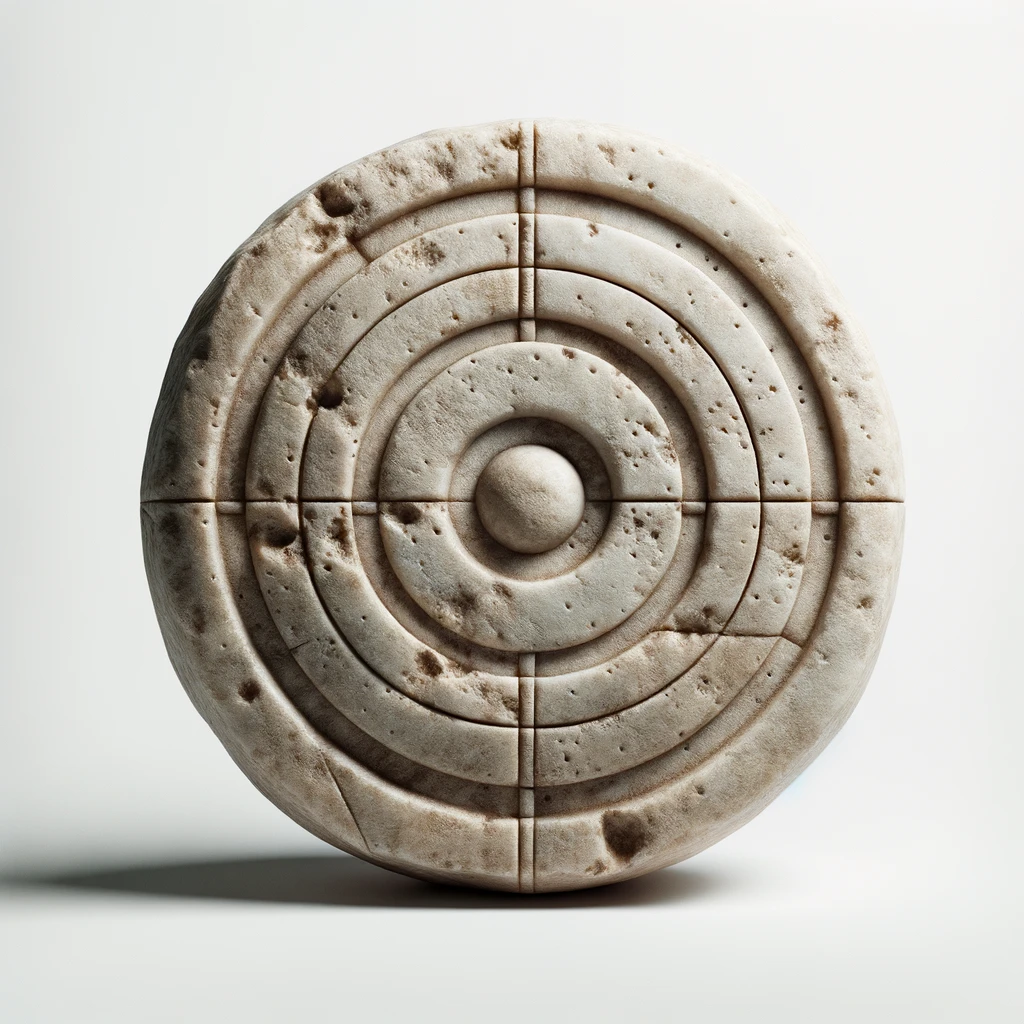
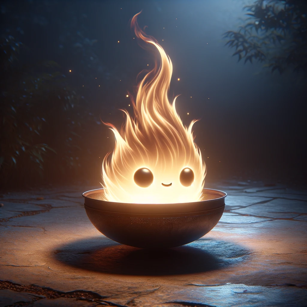
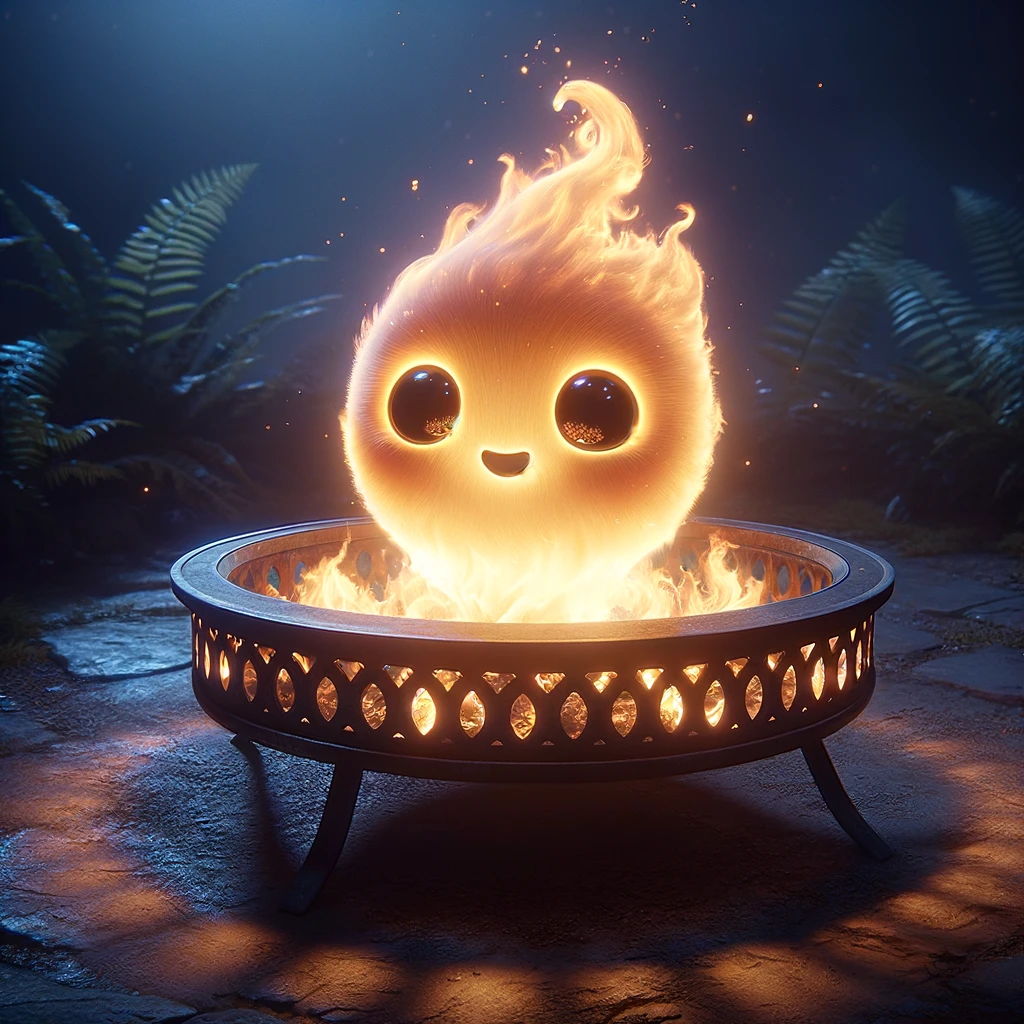
ChatGPT, Midjourney, and CSM helped the team create interactive experiences within the alien landscape. The incorporation of AI-generated components led to the development activities, such as a target shooting game and an interactive fire spirit. 

While these interactive elements weren’t generated “whole cloth” by GenAI tools, the GenAI applications made the creative process more efficient and enabled a smooth flow from conceptualizing ideas to implementing tangible in-game elements.

Envisioning the Future of GenAI

The final exploration zone, named the Holodeck, symbolizes the future potential of GenAI! Using the GenAI tools from Blockade Labs, the team created an experience where players can choose from a variety of generated 3D environments - a glimpse of the future where immersive 3D environments can be generated on the fly in response to player input.

Conclusion

Fractura is a milestone in Rec Room’s exploration of GenAI, highlighting both its transformative potential and the challenges in integrating it. Fractura exemplifies how Rec Room creators can leverage GenAI and Rec Room Studio to iterate and craft engaging rooms efficiently based on their imagination, creativity, and vision.

Data Tables and Rewards

Managing lots of data in Circuits, especially stuff like sequential strings for dialogue or the details of a progression system, has always been pretty tricky. It requires a ton of variables and complex graphs to select which to use in a given circumstance.

It’s more typical for game designers to use a specialized tool for things like this - like a good ol’ spreadsheet! Given the excitement around Make it to Midnight’s progression and this need, we’re introducing Data Tables, a tool to help make this easier.

Pictured: In-development version of data tables. The UI may be slightly different upon full release. 

How do DATA TABLES work?

To start with Data Tables, spawn a Data Table definition chip with the maker pen and configure it to get to the edit screen. From there, you can add columns and rows. Each column is assigned a Type - int, float, bool, string, color, or Reward (more on these later!)

Input your data, adding or copying or moving columns and rows as needed, and then save. 

⚠️Important: You must use the “Save” button in the data table editing UI, which will then save the room. Saving the room via any other method - including another player saving it while you’re editing - may result in lost work. 

Once there’s data in your table, you can use more chips to pull it out of the table and into the rest of your code.

Configure the DataTable Get Cell chip to point at a specific Data Table and column. (You’ve gotta specify the column in advance because we’ve gotta know the Type of the output pin!) Then, you can extract data from that column on a per-row basis.

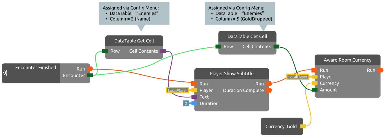
The idea is that each row is a set of similar data, and you’re doing the same operation on different sets depending on the circumstances. Let’s say you’ve got a table named Enemies that contains details about various enemy encounters:

You can notify players about each kill and hand out gold with a relatively small graph. Here’s a simplified version here:

You can also search for information within the Data Table. Using DataTable Get Rows Containing or DataTable Get First Row Containing you can reference row information based on the name string “Goblin” (sorry, exact matches only). Or you can pull a random Challenge 6 enemy to throw at your players without having to hard-code what row in the table they’re on.


Rewards

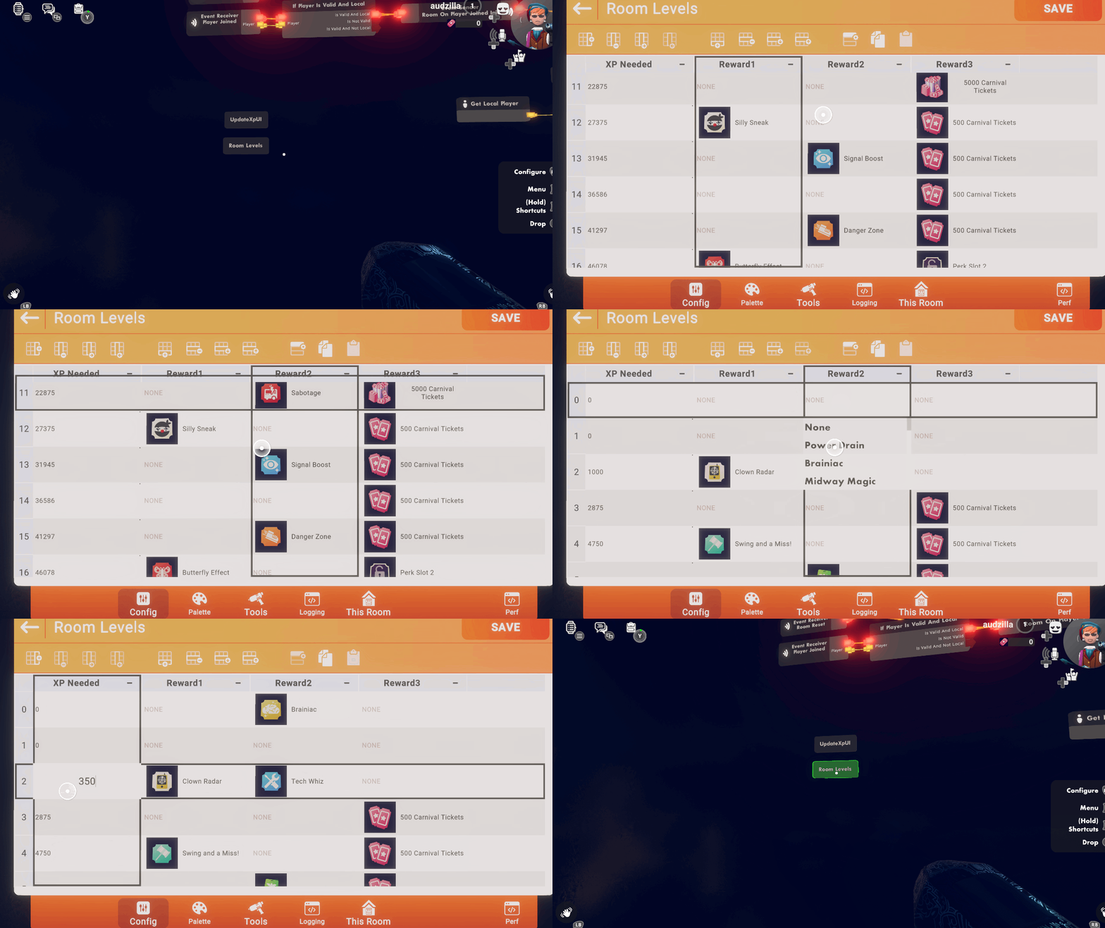
Rewards are a way to pack keys, currency quantities, and consumable bundles into a data table with a consistent and slightly fancier presentation. Rewards are used heavily in the upcoming Progression system (more info about that soon!), and you may have noticed that the gif at the top of this post is from Make it to Midnight, where we’re using Rewards for the Perks. 

You make Rewards a lot like you make Keys and Consumables. Check your Room Settings for a new tab!

Once your room has some Rewards ready to go, you can put them in a data table and/or directly grant them to players with the Reward Constant and the Grant Reward chip. (For those curious, Make it to Midnight’s Perks uses Rewards to grant Keys, and then those Keys enable Circuits behaviors by using Player Owns Room Key as a filter.)

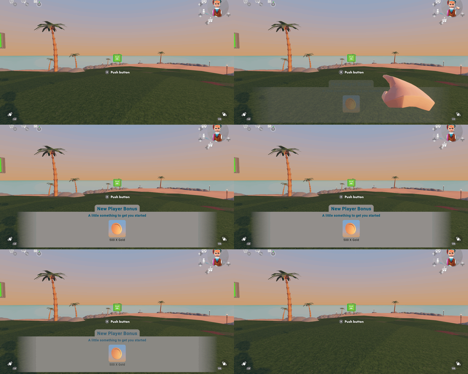
There’s also a new Show Reward Notification chip that you can use to notify players of between 1-3 Rewards at once.

For advanced users

Don’t want to type in all your data manually?

There’s an Import button on the Data Table edit screen. It’s expecting CSV, which you can usually export from other spreadsheets:

Here’s an example of the formatting it’s looking for:

schema:

Score,int

Speed,float

Title,string

CanUseTurret,bool

Rank,Color

data:

10,1.5,Scaredy Cat,False,8080FF

200,2.75,Brave Warrior,True,FF80FF

500,3.25,Expert Player,True,FF8000

Note: This doesn’t work for Rewards. You’re better off leaving those blank and hooking them up in the game.

What’s next?

A Progression system that builds on Data Tables and Rewards - as seen in Make it to Midnight - is coming Soon™.   Watch this space for a tour when it ships!

Avatar Movement & Gameplay

In past blogs in this series, we’ve talked a lot about how the new full-body option will look. In this one, we’ll show off how it moves and interacts with the game world.

Just chillin’

There are so many ways we express ourselves through our avatar’s movements. We point, give a thumbs up, jump, slide, and dance. We shoot lasers, dodge paintballs, throw dodgeballs, and raise our hands in celebration! The full-body option needs to look great doing all those things and more. As you can see from that list, how we move our hands is a big part of how we interact with the world, so let’s start there.

Helping Hands

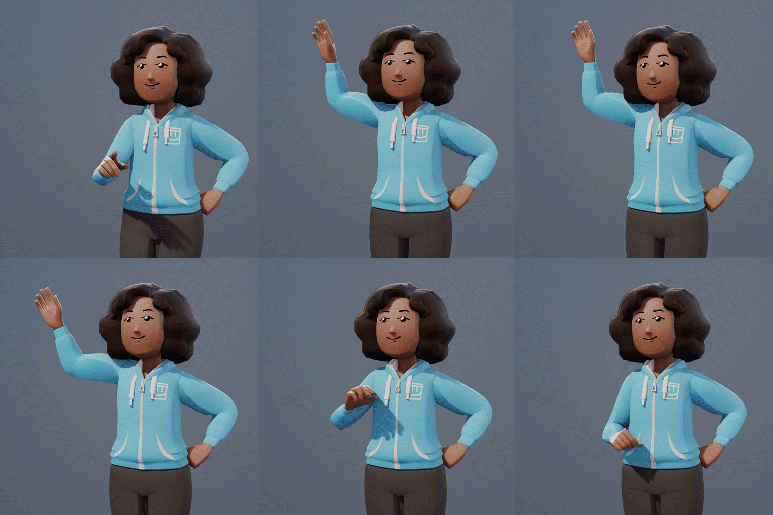
One of the most important ways we use our hands in Rec Room is to connect with other players. When we wave hello, fist bump to join a party, or give a high-five, we’re expressing ourselves to others, and we want those expressions to look great. To accomplish that, we need to think from the hand through the wrist, arm, elbow, shoulder, and even down through the torso, hip, and legs. 

Pretend someone you know is across a crowded room from you, and wave at them. Do it now. We’ll wait. Notice how your whole body moves and shifts a bit as you raise your arm. Those are the subtle movements we’re trying to capture in the avatar animations to make them feel alive.

Hello there!

Another area we think a lot about with hands is how they hold objects. Currently, your hand disappears when holding any object. While this was useful in the early days of VR, as we develop full-body avatars, we want hands to be more expressive as you grab objects. It would look a bit weird to cut off your hand while holding something, so instead, your hand and fingers take a position that is natural for each object. You'll pick up a coffee mug like you normally would and throw a frisbee while grabbing an edge. Picking up objects will feel more realistic, and your hands will seamlessly pose to a natural fit for everything in Rec Room. You'll be able to do all the same things you normally can, except now the objects will be connected to your avatar via your hand. 

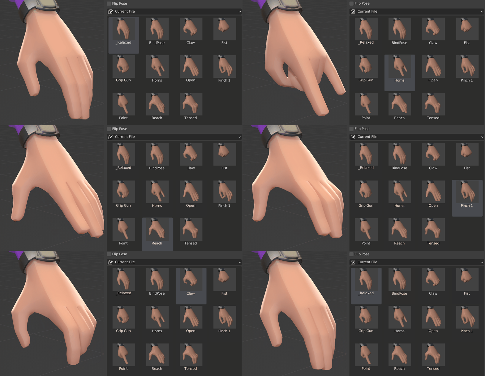
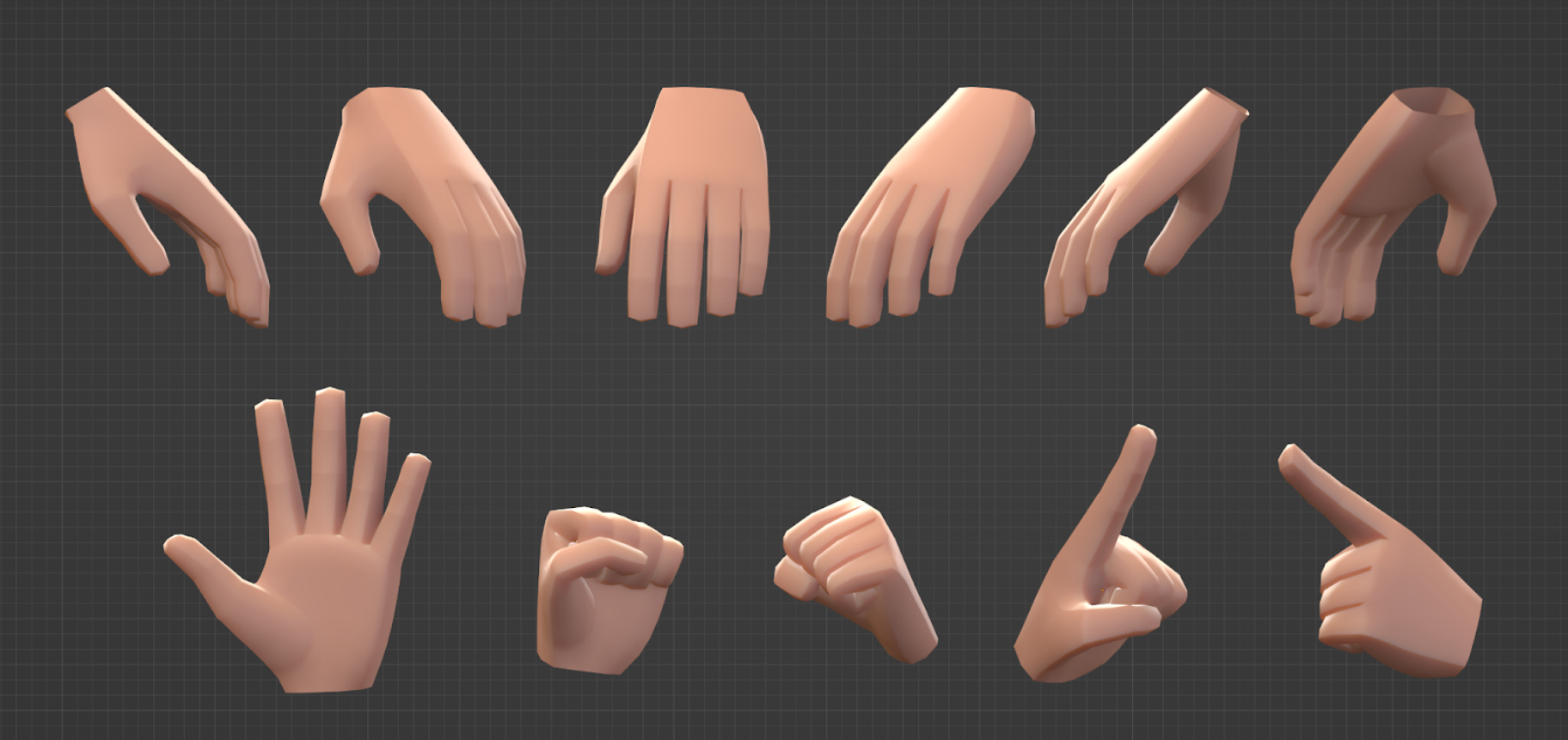
And it’s not just hands and fingers around objects that we’re thinking about. With finger tracking, we need to think about the full range of finger movement. You’ll no longer be restricted to a small set of hand motions. Want to wiggle your fingers - go for it! Want to bust out the horns - rock out! Want to put up a peace sign - groovy! (Note: finger tracking will ship after the full-body avatar option, but that doesn’t mean we aren’t stoked about it.)

Here’s an example of how hands might move with finger tracking

Get a Move On

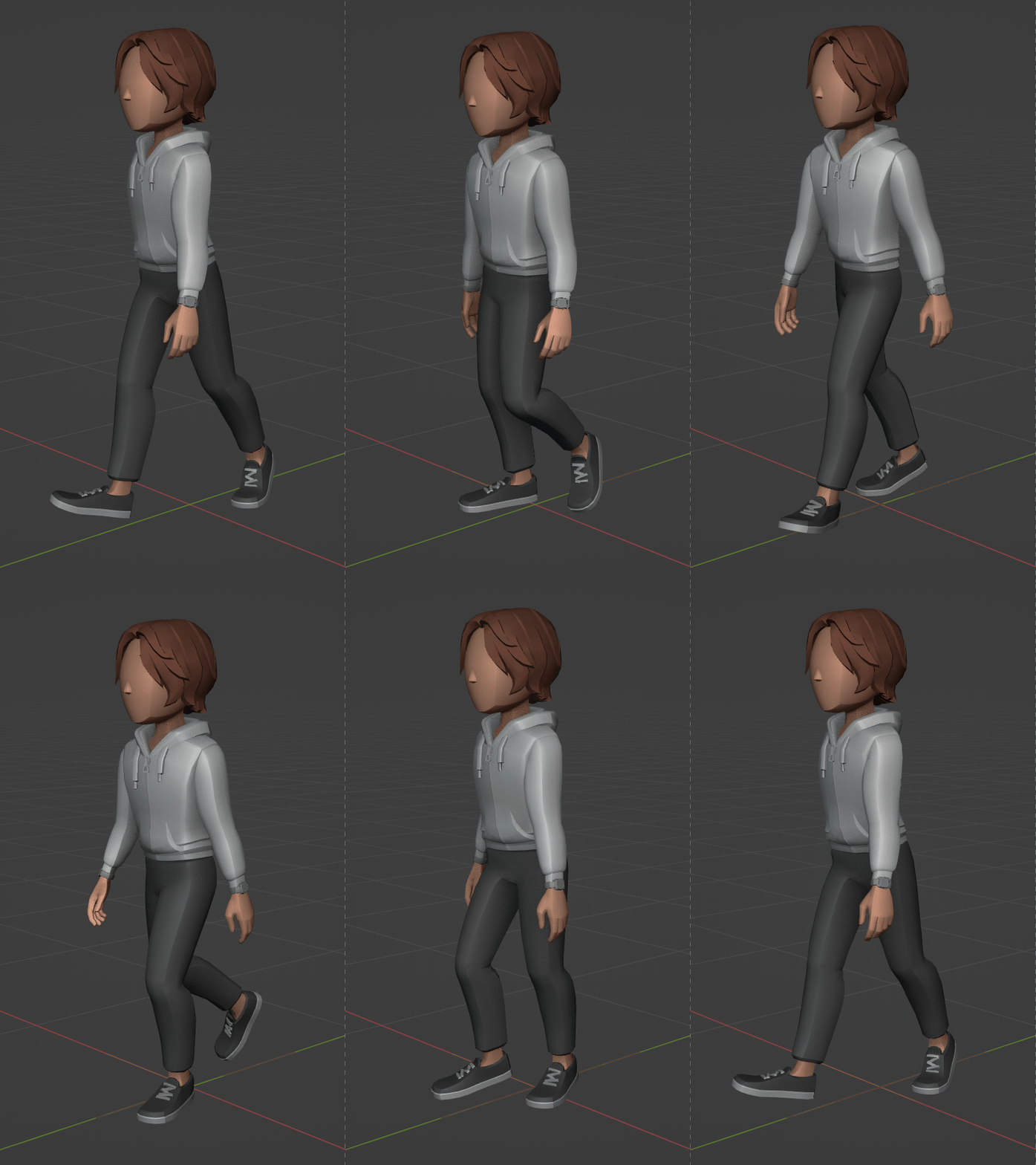
Let’s zoom out and look at how the rest of the body moves. There are several ways we move around in Rec Room: walk, run, jump, climb, crawl, slide, and wall run. Each of those needs to look good individually, and the transitions between them need to be seamless. Also, even more so than hand movements, these actions require the whole avatar to be moving in sync to look natural. Take a look at the run animation below. Notice how it’s important to get the arms, shoulders, and head moving in sync with the legs.

Walking, Jogging, and running are looking pretty good. Climbing… still needs some work

Game Balance

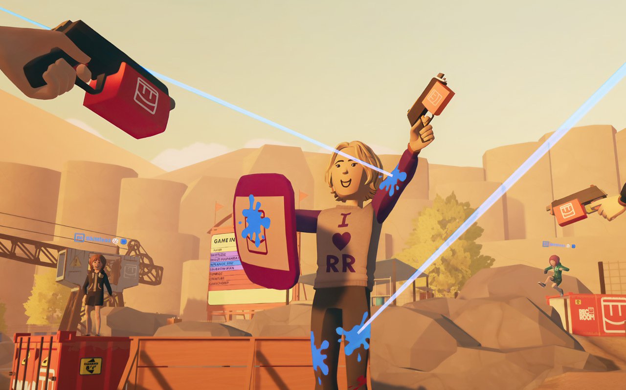
One of the questions we’ve gotten about the full-body option is, “How will it affect game balance in PVP rooms?” Specifically, since the full-body option has more surface to get hit, will people who choose that option be at a disadvantage in rooms like ^Paintball? 

We see Rec Room as a fundamentally casual game, one that isn’t optimized for rigorous competition, but we still took that question seriously. We ran playtests with some of the most skilled paintballers at Rec Room, where we pitted a team of floating beans against a team of full bodies. The same players took turns using each avatar option, and any part of the avatar hit with a paintball counted as a KO. We found floating beans don’t have a significant advantage (and we found the full bodies are delightful to compete against).

With all that in mind, here’s the plan. You will be able to play with either avatar option in any room. Any part of the avatar you can see (arms, legs, etc.) will be a part you can hit. For competitive formats, like Leagues, where even the tiniest advantage seems meaningful, organizers are welcome to restrict participants to one avatar type or another.  

Full-body or floating bean, you’re gonna get KO’d if you stand on a container and let everyone shoot you🙂

What’s Next?

Looking back on the whole blog series, we’ve given you the gist of how the full-body avatar option will look, move, and represent you in the Roomiverse. But there’s one more big piece we haven’t gone deep on yet. The full body is the foundation that you’ll build on when you make your own clothing and, eventually, your own avatars. We’ll dig into that in the next avatars blog.  

But before we get to that, we’d like to leave you with the latest iteration of the full-body option!

What do you think?

Avatar Faces

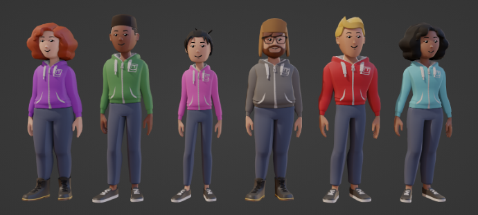
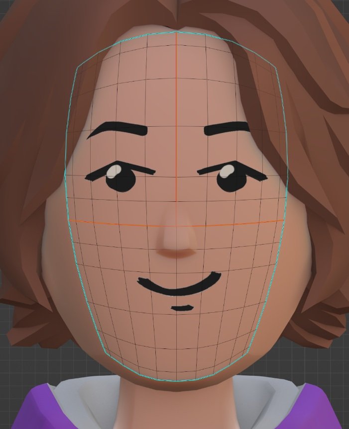
In this fourth installment of the Avatar Dev Blog series, we’ll talk about the face of the full-body avatar option. The new face will look a lot like the floating bean’s face with a few noteworthy additions. Let’s take it from top to bottom.


The grid shows how the face is divided up under the hood.


Eyebrows

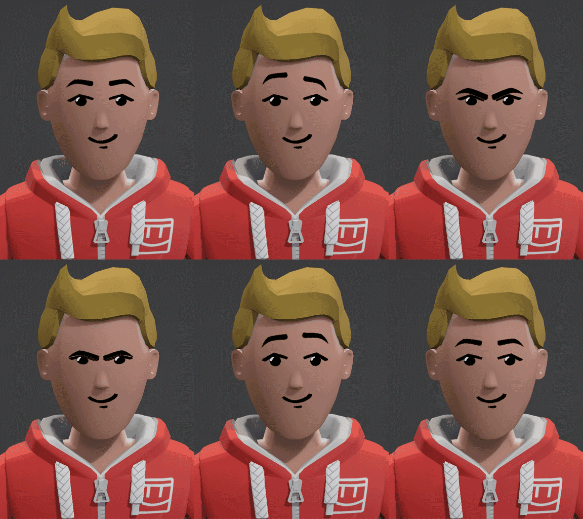
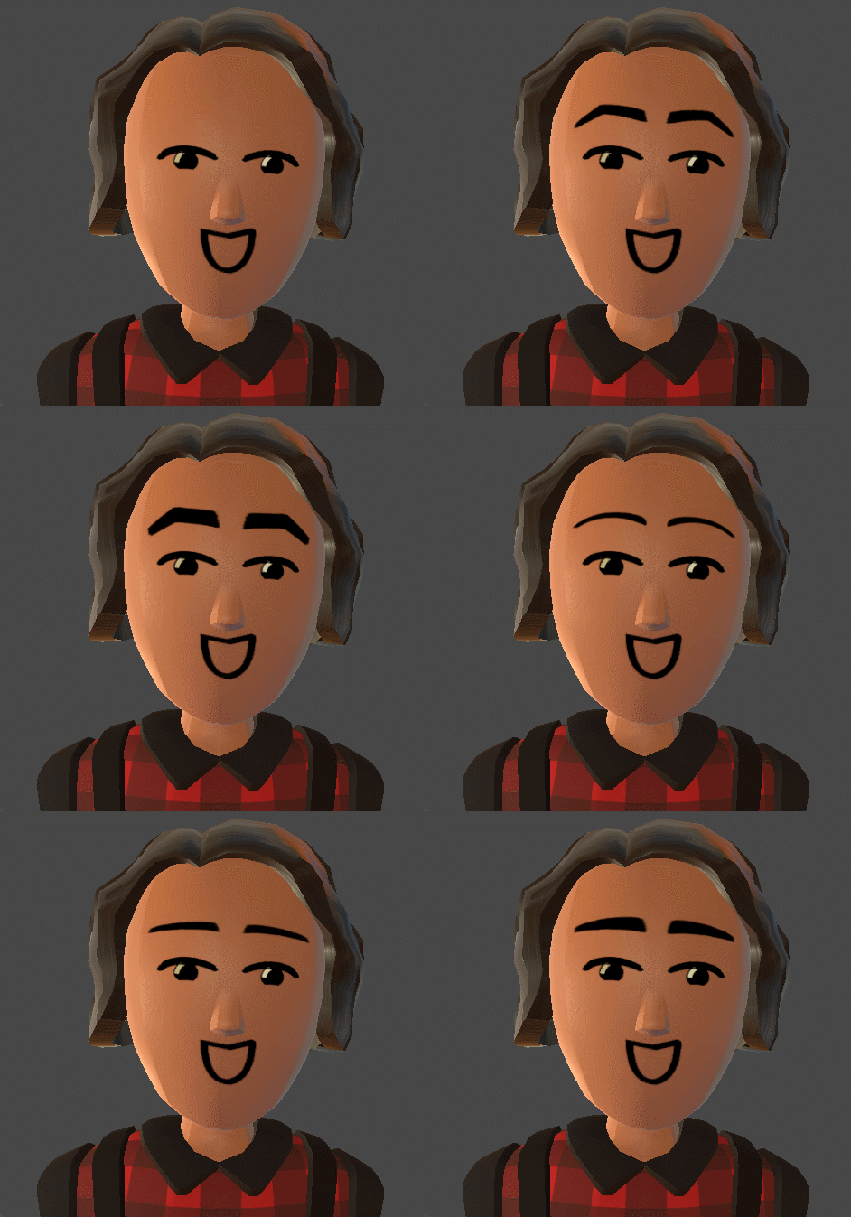
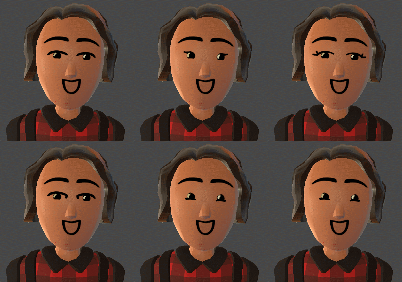
Eyebrows are a new optional addition to the full-body avatar. We added them to give your facial expressions more depth. They’ll be in the same drawn-on style we love with that charming wiggle like the eyes and the mouth. This brings them to life and lets us incorporate them into the facial animations when you emote.


A fun animation test (not actual gameplay) of an avatar emoting with its eyebrows.


At launch, you’ll get to pick from three different eyebrow shapes with the ability to adjust their size and position. We also want to give the customization option to go without eyebrows, since even though we feel like it expands the range of expression, we heard the feedback that some of you would prefer to express yourselves without them.


Thin, medium, and thick in three different styles.


Eyes

The full-body option will have many of the eye shapes you’re familiar with, along with a bunch of new options so you can really dial in your look. They work with all the emotes like the old ones do, so you’ll still be able to express your love 😍 or joy 😂 through your eyes. 

We’ve also added an eye shine to all the eyes to bring a bit more life and gravity to the avatar’s face through added contrast between the eye and highlight. Without the eye highlights, the eyes felt duller in comparison to the newly upgraded body. You might notice below that we’ve turned down the shine a bit from what you saw in the last concepts. We too thought they were a bit too distracting at their original brightness level.


We love how each eye gives the face a different character.


Noses

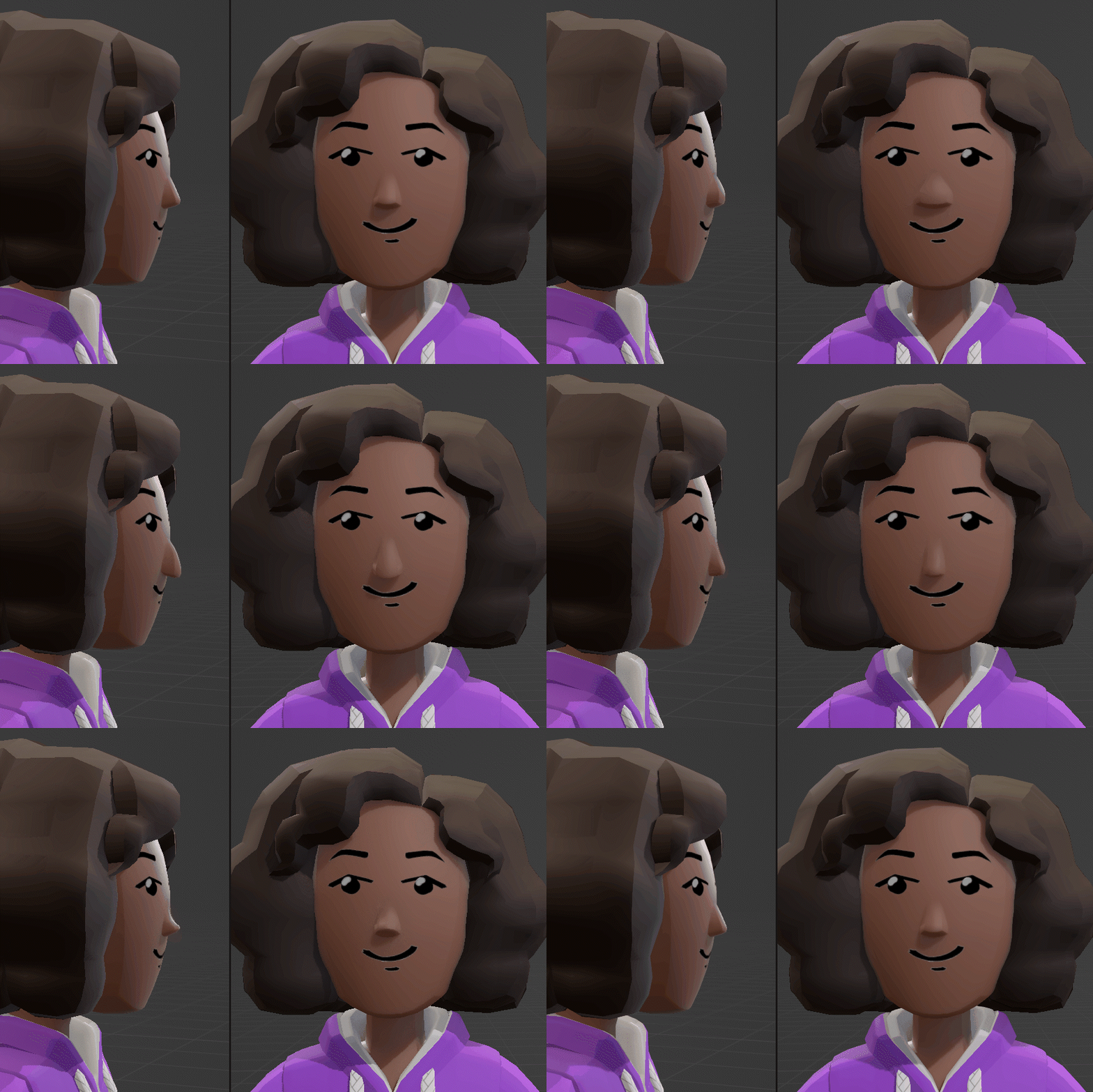
Another new addition to the full-body avatar’s face is the nose. We found that one of the more effective ways to express yourself through your avatar is to have an identifiable silhouette. So we explored noses as a way to define your silhouette from the side. Even though it’s a relatively small part of the avatar, we found it to be surprisingly effective at giving each avatar a unique look. 

This also explains why the nose isn’t in that drawn-on style like the eyebrows, eyes, and mouth. They are there to give you facial expressions, while the nose is there to define the form of your face.

In our iteration and experimentation, it became clear that overall the full-body design was more appealing with a nose than without, but we heard that some of you felt strongly that you wanted “no nose” as an option to express yourselves. With that in mind, at launch, you’ll get to pick from about eight nose styles and tweak their size and position, or choose to have no nose if you prefer to rock that Voldemort style.

You can see here how the nose dramatically changes the vibe of the silhouette.

And the Rest

The mouths are the same for the full body as they are for the floating bean, and they will work the same way.  Your options for face/head shape will be similar as well. The color of the skin on the face will be a tiny bit different though. We’re adding more depth to the skin color. This lets us give faces a bit of a flush to make them feel more alive. It also lets us have lighter palms on the hands of darker skin tones for better representation. 

Note the lighter palms.

What’s Next?

As you can see, we’ve already made several iterations to the face based on your feedback, so keep it coming. While we think it’s getting close, we plan on having a few more rounds of interaction before we add the full-body option to the game. Speaking of games, in the next blog, we’ll look closer at how the full body will affect gameplay, and see it in motion!

Rec Room Studio and Generative AI

Unless you’ve been living under a very large rock, you’ve probably experienced the hype around generative AI. We wanted to share our thoughts on how we think these powerful new tools will impact Rec Room, especially Rec Room Studio.

While it’s early days, we think the hype is warranted! Tools like ChatGPT, Midjourney, Stable Diffusion and others are becoming more powerful at an impressive clip. Every day announces intriguing new possibilities for streamlining, enhancing and even completely revolutionizing the art and science of game development.

We are excited for Rec Room creators to integrate AI tools into their workflow. And the obvious starting point for doing that is Rec Room Studio (RRS). Just as RRS allows creators to import and utilize content from Blender, Maya, Photoshop, and a whole constellation of other tools, it’s also a great vehicle for AI-generated content.

Here are some of the experiments we’ve seen so far…

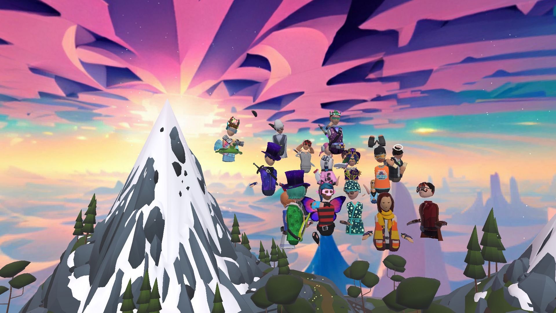
Creator Emma Bitt used generative tools to generate parts of her amazing room “Mountain Spirits”. You can visit it right now!

https://rec.net/d/room/MountainSpirits

RRS design lead @zizzyphus has been using Midjourney to create textures for her WIP “Quilted World” room:

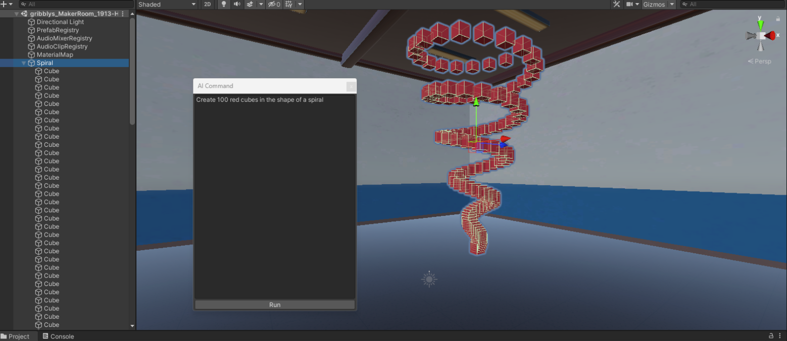
And @gribbly has been experimenting with integrating ChatGPT directly into Rec Room Studio (inspired by AICommand by Keijiro Takahashi of Unity Japan). In the following images, the red spiraling shapes were generated via a ChatGPT prompt entered directly in the Rec Room Studio UI, then published to all of Rec Room’s supported platforms instantly:

These examples barely scratch the surface of what will be possible by combining generative AI with Rec Room Studio. But we think they point at an incredibly powerful workflow for our creators.

We invite you to help us discover what’s possible - we can’t wait to see what you build/generate!

Avatar Embodiment

Welcome to the third dev blog about the next evolution of Rec Room avatars. In the last blogs we talked about the optional full-body avatar and how clothes will work with it. Here we’ll look at another benefit you’ll get with the full-body option - enhanced embodiment leading to greater self expression. The new avatar system sets us up for full-body and finger tracking, but even if you don’t have tracking capabilities, seeing an avatar that looks and moves more like you is a real boost to immersion. 


A concept image showing a peek inside the full-body option while it’s being controlled by a player with full-body tracking. 


What makes the avatar move?

First, let’s take a high-level look at the bits inside the avatar that enable you to bring it to life.

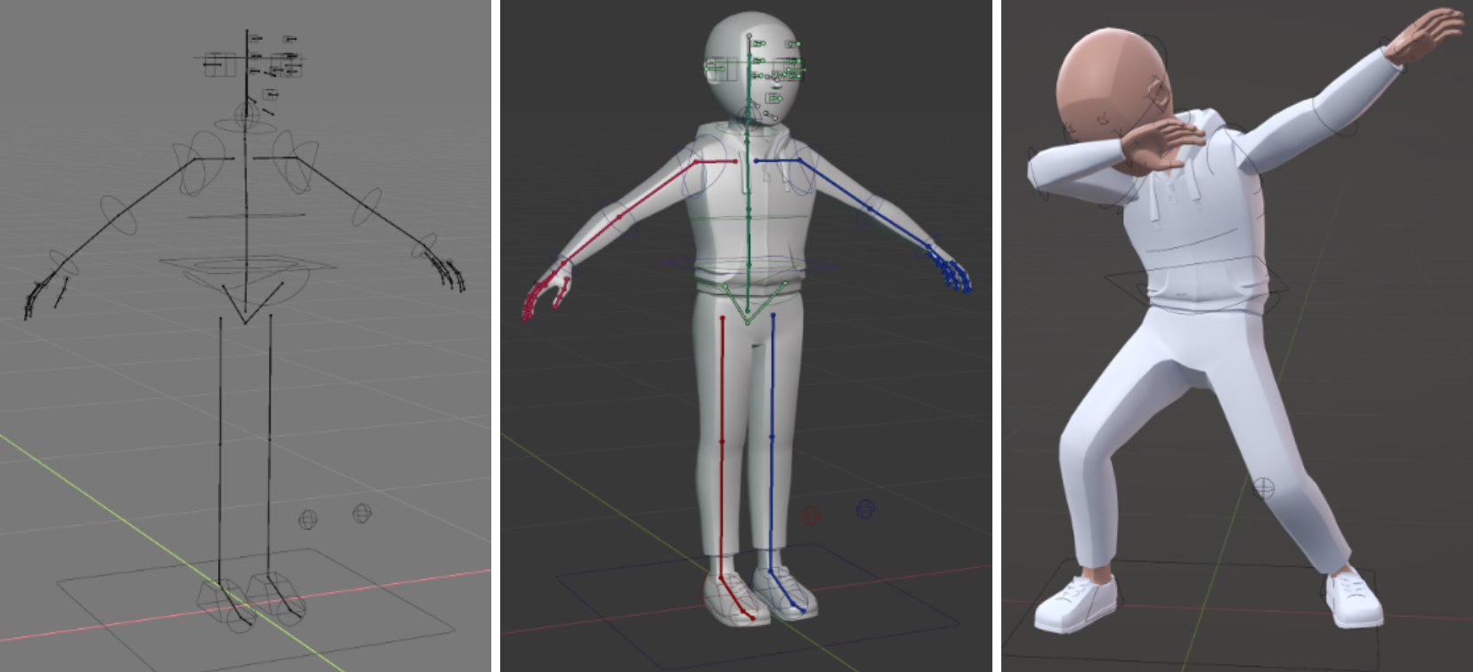
The avatar has a skeleton that defines its base form, how all the pieces are linked together, and ultimately how it can move. Then there’s the model which goes over the skeleton and defines the shape of the avatar that we see. The skeleton and model come together to define how you look when you move.

Lastly, we add animations to make the avatar seem alive when you’re idle, and keep the movements smooth and understandable while you’re active. There’s lots of tweaking and tuning done at each layer to make sure the avatar’s body doesn’t fold or bend in weird ways as you move around.

From left to right, the underlying skeleton, the skin and clothing we layer on top, and the animations that make it move.

Yeah, but how do I make the avatar move?

With a basic VR setup the inverse-kinematics system (IK) will place your elbows and shoulders in specific locations based on the position of your headset and controllers. This is the same tech we use when you wear a full-body costume currently. Guessing where your arms are by the location of your head and hands is a hard problem. We’ll iterate on how to make the upper body animation look good, but if you want the most accurate representation of how you’re moving - that’s where full-body tracking comes in. With SteamVR’s full-body tracking tech you’ll be able to tap into more of this IK system to position your full-body avatar’s elbows, chest, hips, knees, and feet! 

For finger tracking, we’ll be adding support for the newest Meta Quest headsets. Point 👉, give a peace sign ✌, throw the horns 🤘…and your avatar will do the same. Maybe at some point you’ll be able to ditch the controllers altogether.

We’re hoping to have support for full-body tracking when we launch the full-body option later this year, but bear with us if it comes out a bit after the initial launch. Finger tracking will take us a little longer, but we’ll get there.

Work-in-progress hand model

How do you blend animations and my movement?

Without tracking, your movements will be responsible for the full-body avatar’s upper body (head, shoulders, arms) while avatar animations are responsible for the pose of their lower body (hips, legs, feet). This is because in VR we don't actually know where your legs and feet are located so we have to rely on an artist's interpretation - since we do know where your head and hands are, we try to pose your avatar to respect your real VR pose.

However, if you're using full-body tracking then we’ll know where your legs and feet are - so we can dynamically switch between using avatar animations and VR tracking information to pose your lower body depending on the situation.

While you're running around we'll continue to play animations on your legs - despite the fact your real legs aren't actually moving - so that you appear to be running to other players in Rec Room. Once you stop walking in-game we'll blend back to showing your real leg positions so that you can dance and pose however you like.

Okay, it’ll move like me but will it look like me?

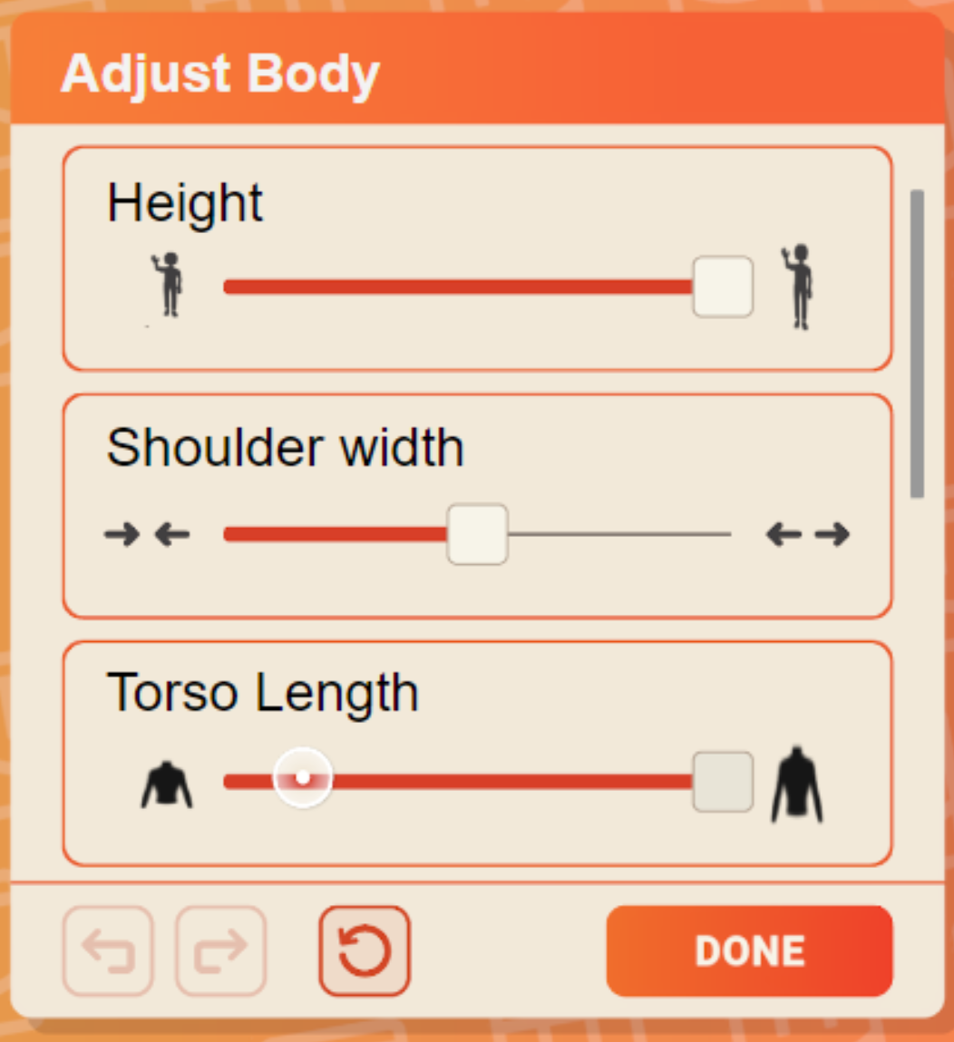
Just like with the current floating bean avatar, the full-body option will let you adjust the shape of your body. But instead of just a few options, you’ll be able to set the individual sizes and shapes of lots of different body parts - enabling near-infinite possibilities. With these new settings you’ll be able to create a more accurate (or idealized) depiction of yourself to embody. The settings we’re currently discussing include the ability to adjust: your height, the length of your torso, the width of your shoulders, belly, and hips, and the thickness of your arms and legs. We’ll have several options to adjust your face as well, but we’ll go into them further in a future blog. 


A mockup of what the body adjustment settings might look like.


What’s next?

Speaking of that future blog, we’ve heard a lot of feedback from you on the eyebrows and noses of the full-body option, so we’re dedicating the next blog in the series to the face. We’ll talk about the evolution of facial features, show off some of the options you’ll get to pick from to customize your face, and talk about the changes we’ve made based on your feedback.

Dressing the Full-Body Avatar

One of the main reasons we're developing the full-body avatar option is to give you even more ways to express yourself in Rec Room! We believe one big part of how you express yourself comes from the clothing that you wear. As we said in our last dev blog, the full-body option will support all existing avatar items at release. Today we’ll talk about how that will work, and about the new items the full-body will unlock.

Converting Torso Items

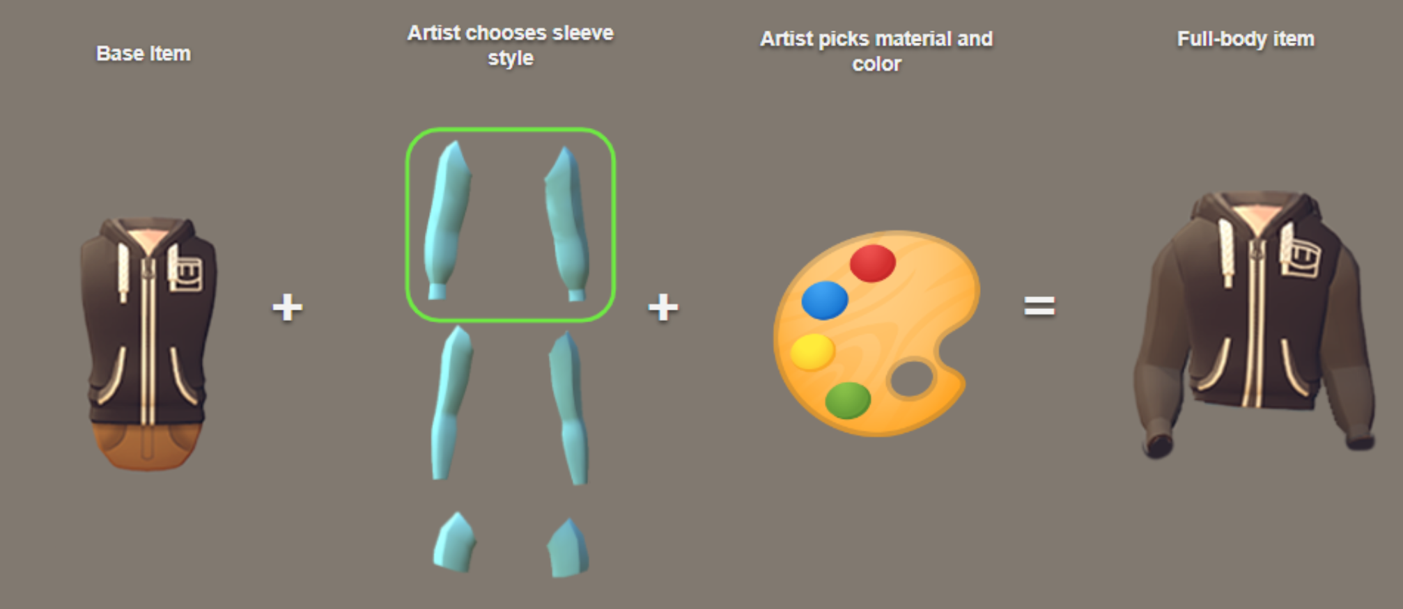
Sleeves were one of the first parts of dressing the full-body we thought about. None of the existing items have meaningful sleeves since the floating beans don’t have arms, so we had two options - have all tops on the full-body be sleeveless or figure out a smart way to add sleeves to the old items when they are on the full-body. We decided on the latter. 

To do that we needed to create a universal sleeve design that could apply to the many different styles of torso items Rec Room has to offer. We've created these concept designs, where one of our skilled 3d artists will then take a sleeve style that best matches the base item and cut holes, stitch, and apply color and materials to each item. The end result will be sleeves that look like they were there all along! 

All items at release will have a version for floating beans and one for full-bodies. This image shows how we plan to create the latter from the former.

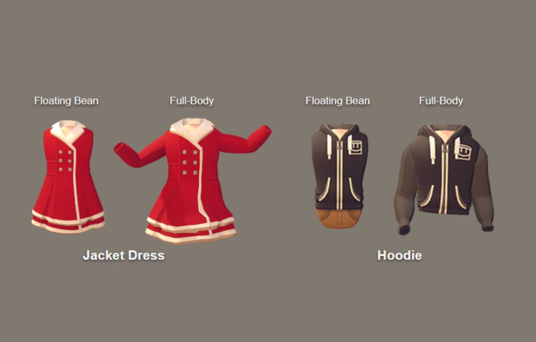
Once we figured out the plan for sleeves, we had to address the fact that many torso items already included a bit of a “leg item” in them. For example, the tan pants on the hoodies above or the skirt on the jacket dress below. We can’t just extend them all the way down, since we want you to be able to mix and match tops and bottoms so you have greater ability to get your avatar to look like you want it to. So again we’ll turn to our awesome 3d artists.

Each torso item will get individual treatment so it looks great on the full body option.

For some items, like the hoodie, where a leg item is implied, they’ll trim off the bottom bit letting you replace it with whatever it you want. For other items, like the jacket dress, where it’s more all one piece, they’ll leave the bottom bit in place, and you’ll get to choose what you want to wear under it (e.g. a pair of tights).

Converting Hand Items

Another bit of anatomy you’ll get with the full-body option is fingers. That means we need to figure out how to make a bunch of items that were made for a wristless mitten-hand work on a hand with five digits that’s attached to an arm. 

This one is more of a work in progress, but we hope the same principle we used for sleeves will work here. In a sense, we’ll have five little sleeves, one for each finger, that those awesome artists will match to our existing items to turn mittens into gloves.

Ironing Out the Wrinkles

While we’ll do our best, converting old items to work with the full-body option won’t be 100% perfect. There will likely be bits that look off or broken at first. But we’ll keep iterating on them until we get all the wrinkles out.

And don’t worry, none of these changes will affect the items when floating beans wear them. If you choose to stick with the floating bean avatar your items will look like they always have!

New Leg and Foot Items!

Now for the shiny, sparkly new stuff we're really excited to introduce - leg and foot items! We think this new clothing goes a long way to helping you be yourself, or whoever you want to be, in Rec Room.

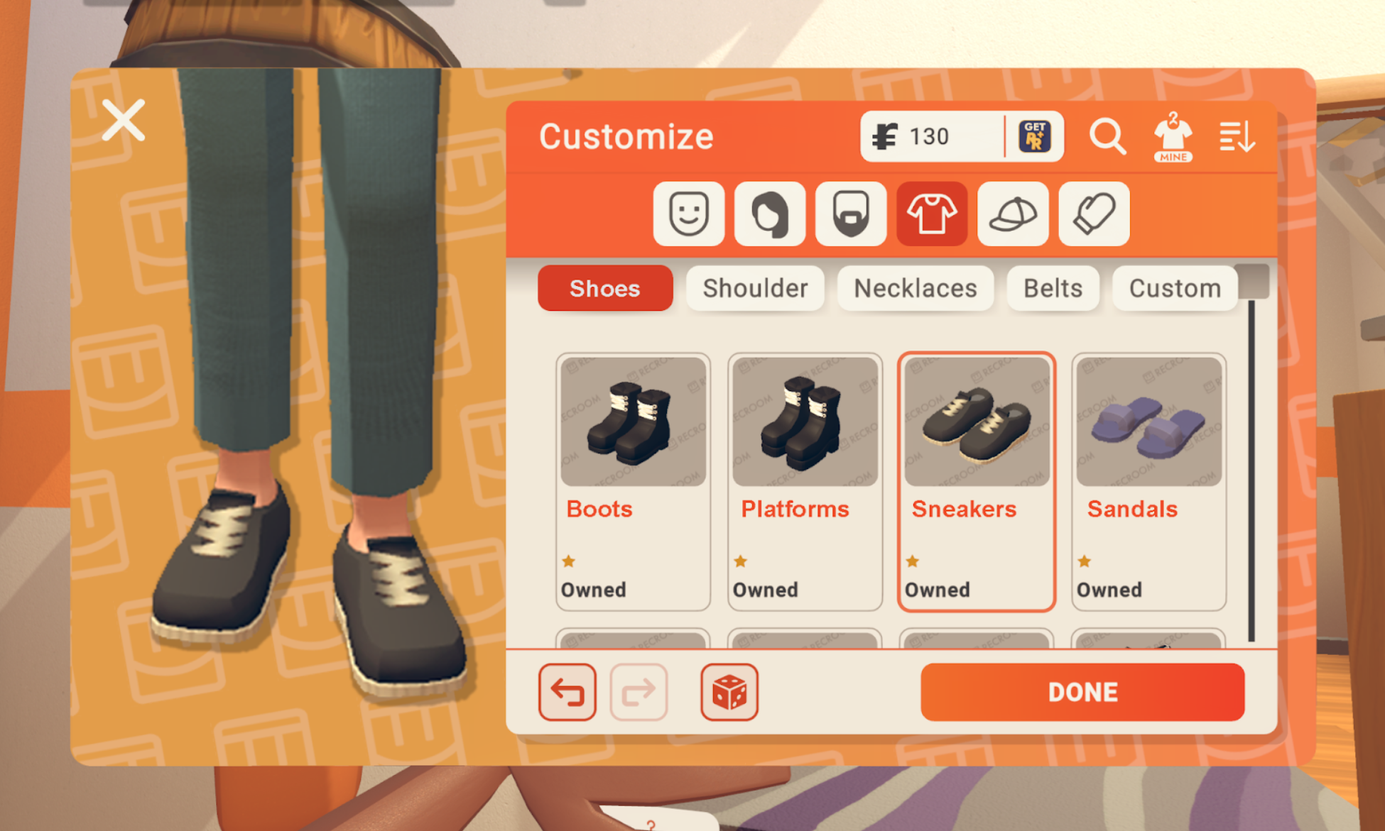
For foot items, we’ll have about four starter options at launch. We’re currently thinking: sneakers, boots, flats, and sandals. Sneakers will likely be the default because it's unsanitary to be walking around the Rec Center in bare feet. We’ll add more foot items as time goes on.

These shoes are for mock-up purposes only, but we’re excited for all the potential foot items. Flippers? Bunny slippers? So many possibilities!

Similar to the foot items, we’ll have about four starter leg items and more soon after. We’re thinking about starting with jeans (default), tights, shorts, and a skirt.

What else should we add?

What’s Next?

We’ll be making lots more of all kinds of items, and might eventually take advantage of other new item slots that the full-body option gives us. No promises, but here are some things we’ve discussed: nail polish, socks, and nose and eyebrow piercings.

Let us know what you’d like to see!

Also, the work we’re doing under the hood for the full-body option will allow you to make avatar items for each other, but that’s a topic for another dev blog.

The Future of Avatars in Rec Room

When Rec Room first launched in 2016, we thought of it as kind of like  the “Wii Sports of VR.” At the time, our avatar designs followed the best practices for VR while keeping them charming and approachable. We avoided showing untracked legs and arms because it could break the feeling of presence; we kept facial features cute and minimal to avoid the uncanny valley effect; and we chose simplicity over visual detail so the game ran smoothly. Also, we were a small team with limited time and resources so we chose to keep our avatars simple.


We love the resulting “floating bean” avatars, and know you love them too. But a lot has changed in Rec Room over the last six years. We’re now a bigger team, VR technology has gotten and continues to get better, and we’ve learned a lot about what works and what doesn’t with how you look and move in VR.  Our “Wii Sports of VR” has evolved into a radically cross-platform, social UGC platform. It's time to evolve how we can express ourselves in Rec Room.


Thus the full-body avatar. The arms, legs, fingers, and feet of this new full-body option provide more opportunities for you to be who you want to be in Rec Room. They also let us track movements better in VR, and help make the game more understandable when we share it with friends. 

A concept showing what the full-body option might look like

At the end of last year, we assembled a small team called the "Avatar Initiative" to take the next step towards full-body avatars. Instead of working behind the scenes and revealing a new avatar option as part of an update, we decided to share our progress as we build. Your feedback will help us shape our work so we do our best to make Rec Room better without losing the things that make it special.

Our Design Values for Full-Body Avatars

We take it seriously that any change to avatars is a big deal and might disappoint those who have fallen in love with the floating bean style. So we have decided that it's a top priority to get these two things right:

  1. When we release the full-body avatar, you will not be required to adopt it. The option to choose the new avatar or remain a floating bean will be yours. We will work hard to not change the look of your avatar for you.

  2. The full-body avatar option will fully support all existing items at release. You’ve spent time and money building your identity and outfits, and we don’t want to mess with them!

😳 That's a lot of stuff we've made over the last 6 years

What’s Next?

You let us know your thoughts about our new initiative in Zendesk or on our Discord, and stay tuned for more dev blogs about full-body avatars  as the details firm up. There’s lots to consider: how will leg and foot items work, what impact will the full-body option have on gameplay, in what new ways can you customize your avatar… We'll continue updating you on where we're heading, why we've chosen to go there, and what comes next.

Hierarchical Building

This is a quick overview of our Hierarchical Building alpha preview! I’ll cover how to find it, how to use it, and what’s not working yet. 
If you’d like to walk through it step by step, here is a survey-style tutorial for the basics! (You don’t have to submit, but we’d love your feedback if you’re so inclined!)

What is hierarchical building?

A hierarchical object is an object made up of other objects, just like things in the real world. If you took apart an oscillating desk fan you’d have a collection of other objects - blades, buttons, and motors. Attaching them to each other in the right order is what lets the blades of the fan spin while its head oscillates, but at the end it’s still a single object that you can interact with without thinking about its many parts. 
An object here is defined as any amount of stuff in a container. Think of these containers like our old shape containers, except they can hold more than just shapes - chips, props, components, and even other containers. This is the basis of a hierarchy: containers with other containers inside them.

How do I get started?

Create a new Maker Room. In the room settings, enable the Creative Beta. Once the automatic save is completed, you’ll have a new toggle for the Hierarchical Building Alpha Preview. Enable that, it’ll save again, and then you’re there.

NOTE:  It is STRONGLY recommended that you don’t flip this switch on a room that you care about without making a backup copy first. Not everything works in a hierarchical room yet, and while you should be able to roll back using room restore, this is a one way conversion, and it’s better to be safe than sorry. 

How to make a hierarchy

If you create a new shape at room scope, we’ll add a container above it for you. You’ll be moved inside the scope of your new container so you can just continue drawing - like shape containers today.

Only containers can have children!

Otherwise, there are two primary ways to make an object:

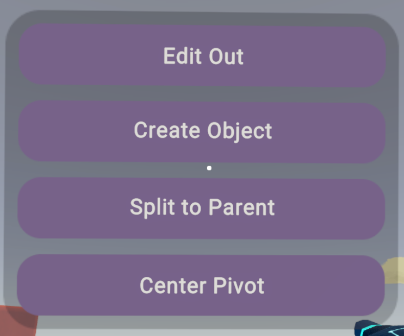
  • The Quick Action Menu available on the Select tool has a “Create Object” option (renamed from Merge.) Create Object will place your selection into a new container.

  • The Connect Tool - connecting one object to another will attempt to make the first object a child of the second. The order matters!

    • If the parent object is a container, the first object will become a child of the container.

    • If the parent is a shape, it will be put into a new container, and then the first object will become a child of that container.

“Scope” is the word we use to define where you’re at in a hierarchy. Your edit scope determines what you can edit, and in some cases, what you can see. “Room scope” is the outermost scope. If you’re inside a container, you’re in that container’s scope, and anything that isn’t “in scope” for editing will be faded out or hidden.

You can use these tools at any scope. Using “Create Object” on a selection of children will create another container, and those shapes will end up one scope lower than they were before.

Navigating a hierarchy


The “Edit” button is how you navigate up and down a hierarchy. If you’re inside a container you’ll see both “Edit” and “Edit Out” at the top of your maker pen menu. Edit Out will take you up a scope, and the Edit tool will take you into the scope of whatever your highlighted target is. 

You can name your containers in the config menu, and you’ll see a preview of their name whenever you edit into them.

You’ll also find these options in the Quick Action Menu when you’re using the Select tool. Edit Out will always be available if you’re inside an object, while Edit In will only be available if your selection is a container. 


The Quick Action Menu also contains other useful options:

  • Split to Parent moves the selected object up one scope

  • Split to Room moves a selected object up to the room scope

  • Create Object is always present to let you add another layer to the hierarchy

  • Center Pivot will center the object point on your current selection.


New Looks

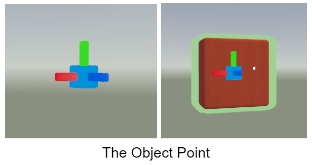
When you start pointing at objects, you’ll notice some new highlight colors. If you point at a shape, chip or prop within your current scope, it will highlight in green as it always has. But if what you’re hovering over is a complex object - a container with stuff in it - it’ll be blue instead, and you’ll see a small holographic box that represents its pivot point.

When you edit into an object, that holographic pivot point preview turns into a small UI widget, similar to our transform handles, that shows local axis colors and can be selected, moved, and rotated. We call this the “object point.” By moving the object point, you’re also moving the pivot point of the object, and when you edit back out again, you’ll see that the holographic pivot preview has moved to reflect any changes you made. 

Gizmos

There are a few things that have changed conceptually, but the visuals haven’t caught up yet! The one I want to mention here is gizmos. 

In a hierarchy, gizmos are containers that can move their children. Therefore, connecting something to a gizmo is done the same way as with any other container. 

What this means is that it no longer matters whether you target the gizmo’s body or the metal axis. All that matters is the order in which you’re doing it. Connecting an object to a rotator will make that object the child of the rotator. Connecting a rotator to an object will make the rotator a child of the object instead. 

Hierarchical Circuits

The circuit layer exists in every scope. As you navigate up and down an object’s hierarchy, you’re simultaneously navigating that object’s circuit hierarchy, too. Any container with chips has an object board that displays the same name as the container. Editing the visible object or its board will take you into the object’s scope.

The object point acts as the anchor for the object board and the scope origin for stuff like “Set Position,” too!

As you navigate a hierarchy, chips appear or not based on whether or not they’re in your current scope. While objects above your scope are grayed out, all chips outside of your scope are hidden completely (though there’s a setting to change this if you’d like to.) 

Tip: Detach your object boards for the best editing experience. We’ll probably make this automatic but we haven’t yet. :]

Tip: Moving things to a new scope in your hierarchy can break existing circuit wires. We recommend that you get your hierarchy as you want it before you do a bunch of wiring!

Known Issues

Props will not function as parents! Not all props - especially interactive props - will function in a hierarchy as children. 

  • What for sure DOES work as child objects: Buttons, toggle buttons, and most components without a player input mechanism (e.g. lights, audio players)

  • What for sure DOESN’T work: Invisible collision, Gun and Trigger handles, all CV1 objects, most interactive props.

  • Avoid for now: Costume dummies, seats

  • Edit tool does not work on Object Boards. Target Containers and Gizmos directly to edit into them. You can't currently access a prop's board at all.

Not yet implemented:

  • Collision, grabbability, and physics settings

  • Tube control point editing

  • Undo/Redo

  • Clone

  • Copy/Paste

If you get stuck

  • If you try to delete something that doesn’t work, you’ve probably run across something that isn’t supported yet. The best thing to do is leave without saving (and we’re sorry about any lost work - we’re chasing these down one by one!) 

  • Rolling back to an old save should work, even if that old save is before you flipped the Hierarchical Building switch.

Got feedback?

We’d love to hear it!  Please join us in Discord or leave us a note on our new Hierarchical Building Zendesk. Keep an eye out for a survey from Coach - in a few weeks, we’ll send one to everyone who’s participated. 

Custom Shirts Marketplace

Custom Shirts Marketplace: The First Step of a Grand Plan

The Economy Team at Rec Room just rolled out the marketplace features of one of our most ambitious projects - Custom Shirts!

Our team’s goal is to make Rec Room a place where our creators can be rewarded (and paid!) for the amazing things they make. Our grand ambition is to build a marketplace where our players make everything they can buy and wear. We believe there is a HUGE market opportunity if we get it right.

Since June of this year, RR+ members have been using the Clothing Customizer tool (found in their backpack) to create their own graphic tees to wear on their Rec Room avatars. Whatever markers, paintbrushes, or gizmos they can use to draw on a whiteboard or art canvas, they can now use to draw their own designs on the front and back of a t-shirt.

When we launched this feature, we were excited (and honestly a little nervous) to see what our players would create. We’ve really enjoyed seeing all of the different designs everyone has been making and wearing.

Like this cute custom shirt from Gen #9930 on Discord!

As we thought about this marketplace, we realized there are some hard problems to figure out. Here are the 4 biggest questions that we faced:

  1. The Avatar Ink Question: How do we reduce ink costs for items players wear, to open up more possibilities for creators? Ink is how we measure the cost to render items, gizmos, costumes, etc in Rec Room. It’s important that the game looks good and runs smoothly across all rooms and on all of our devices, including all of our supported Android and iOS phones.

  2. The Authoring Question: How do we make it easy enough for creators to author the things players wear? And make sure that we don’t lose the charm of what makes Rec Room look like Rec Room.

  3. The Moderation Question: If we let our players make the things our players can wear ANYWHERE, how big of a bee hive are we unleashing on our moderators? There’s a big difference between managing rooms that players choose to go to, and moderating what people can wear in the Rec Center .

  4. The Economy Question: How do we find the balance between enough of a free marketplace so our creators can experiment and enough regulation to avoid exploitation or a race to the bottom? It’s taken us a lot of experimentation to figure out how to best position and price what we sell in the Store (and we’re still figuring it out for ourselves). 

But here’s the thing about how we go after hard problems at Rec Room: instead of spending many months trying to design (and guess) what might be the solution, we build something we can ship fast, so we can learn from our players what the solution should be.

This is why coming out with Custom Shirts felt like the perfect way to test our hypotheses for our grander ambition.

Let’s break it down question by question on why Custom Shirts felt like the right next step.

What Custom Shirts helps us learn about the Avatar Ink Question

Costumes were the first step towards building a way for our players to create what they wear

We’ve been testing creator made outfits ever since we released the Costume prop in rooms. It allowed us to get feedback from creators on what works (attaching shapes to the body parts of a mannequin works better than expected!) and what doesn’t work (costumes are way too expensive and hard to use for a lot of our players).

In order to make costumes wearable everywhere, we have a lot of work to do to manage their ink cost. So we asked ourselves, do we really need to go after this big technical problem to learn all the things we want to learn?

We love drawing on shirts in games like Animal Crossing: New Horizon, and that gave us an idea. What if we simplify the problem by starting with customizing the texturing on pre-defined clothing, like drawing on a graphic tee!

This decision to use textures had a few great benefits. 

  1. To make this work on our servers, all we needed to do is store a single 1 megapixel image for the front and back of each custom shirt. 

  2. Since each custom shirt uses the same base material and geometry, we have fewer concerns about the look of Rec Room changing too much if the Rec Center is filled with custom shirts.

  3. To make this work in the game, we needed to solve how to display textures in an optimized way so we could have up to 40 different custom shirts in a single room. 

This is a much easier problem than getting costumes to work across the game, but there were still some challenges of having this work across the 9 different platforms we support.

For example, we needed to ensure that wearing custom shirts didn’t cause performance issues on mobile devices. To show a custom shirt on an avatar, we need to compress the image on that shirt - a way for us to reduce the file size of that image. However, what happens if 40 people enter a room, all wearing custom shirts that we need to compress? Would the game crash?

We needed to answer this question before adding a way to make custom shirts. So, before we made the clothing customizer - or any kind of creation process - we needed a prototype!

Our first instinct was to grab an image, put it on a shirt, compress it, and see what happened. Because we didn’t have any drawn custom shirts yet, we decided to just use the player’s profile picture. Behold, the very first “custom shirt”

Truly horrifying

We repeated this process 40 times and did some profiling on it. Luckily, we found that the image compression didn’t cause any major problems. This gave us a good signal that once we added hand-drawn shirts into the game, we wouldn’t see any major changes in room performance.

What Custom Shirts helps us learn about the Authoring Question

Examples of some beautiful 2D art our players make using the existing drawing tools

We had confidence that a lot of different kinds of creators can make great 2D drawings on the art canvases that have been in Rec Room for years.

By making a graphic tee be a new kind of canvas, it made it super easy for a wide range of creators to get started. When we launched Custom Shirts, we were seeing compelling new avatar content almost immediately. In the first 41 hours, more than 71,000 shirts were published! At the peak there were more than 3,700 shirts created PER HOUR across approximately 1,000 unique RR+ players ! In the 4 months since the feature has been released, over 400k custom shirts have been published.

Since Custom Shirts was released in June of this year, over 400k custom shirts have been published.

If we launched a feature where customization required using a Makerpen to draw 3D shapes on a costume mannequin, there’s no way we would have attracted this magnitude of creation. Having more creators use the feature means we can learn more about what they want.

We want to get to a place where players can eventually use 3D shapes to create the things they wear, but since our end game is to create a rich ecosystem with a large variety of creators, it feels right that our first customization feature had a lower bar to entry.

The problem is that this lower bar to entry is what leads us to the next problem. Because it’s easier for creators to customize what they wear into the Rec Center, it’s also easier for bad actors to violate the Code of Conduct in a public room.

The Code of Conduct that all players agree to when they sign up

Why Custom Shirts helps us learn about the The Moderation Question

“We had a betting pool among the team on how many minutes it would take until an inappropriate shirt was published. For the curious, it was 8 minutes.”

From the first design doc, we knew that once we made it easy to draw anything on an avatar’s shirt, it would be a matter of minutes after releasing the feature that the first inappropriate shirt was published. We had a betting pool among the team on how many minutes it would be. For the curious, it was 8 minutes.

What we didn’t want is to overwhelm our moderation team with so many inappropriate shirts that we lose our community’s trust in our ability to maintain our Code of Conduct.

We weren’t sure the extent of how many bad actors would emerge, or what tools we would need to manage them. But we knew that avoiding the problem wasn’t an option if we wanted to go after the grander ambition.

We did a few things to manage the risk:

Only creators with a RR+ subscription could publish and wear shirts. We thought the players who are more bought in to Rec Room (literally) would be less likely to create content that violates the CoC. And for everyone who became an RR+ subscriber just so they could make an inappropriate shirt, thanks for helping pay our moderation team!

We wrote enough tooling so our moderation team could easily address issues as they are reported, our in-game moderators could have insta-ban hammers, and anyone who had a bad reputation or a custom shirt under moderation review would be disallowed from publishing any more shirts.

For our first release, we made it so our players could publish shirts that only they could wear. So if an inappropriate shirt appeared on our platform, it couldn’t easily spread to other players.

Of the 400k custom shirts created so far only around 1.7% shirts have been reported and moderated. That’s still higher than we would like (that’s about 6,800 shirts!), but within reason that our world class moderation team has been able to manage it. It’s also helped inform how to improve our tooling including helping us write a feature to automate moderation using the training data from the last four months.

Now that we’ve built up our moderating muscle for Custom Shirts, it’s given us confidence that we can take our next step. It’s time to build a creator-driven avatar economy!

Why Custom Shirts helps us learn about The Economy Problem

Shortly after we released the ability to make custom shirts in the dorm room, something really interesting happened.

^MorbMachine, a room that used the clothing customizer to print Morbius shirt designs using circuits and gizmos, started topping the charts. It became one of our most popular rooms within a day. This was a surprise to us for a couple of reasons:

We hadn’t intended for the clothing customizer to be usable outside of the dorm room, and

People were VERY excited about this room and the custom shirts it created.

^MorbMachine, along with other shirt-printing rooms, quickly became a hit on the platform. We proudly wore our Morbius shirts in-game. Every day was Morbin Time! But more than anything, this room helped us realize that we really needed a way for players to share their shirts with each other.

Proudly showing off a community made custom shirt from the ^MorbMachine room

Unfortunately, we found a bug that was causing a 10% increase in crashes. In order to fix this, we needed to stop initializing the customizer upon entering most rooms, meaning it could no longer be spawned outside of a dorm.

But this would break ^MorbMachine. None of us wanted to do that. We decided the best compromise would be allowing any rooms currently using the feature to continue using it, as long as they didn’t update the room. In the future, we may let creators turn on customizer spawning on a per-room basis, because we really don’t want these types of rooms to go away forever.

The viral success of ^MorbMachine and other custom shirt printing rooms has taught us a lot about the community. Rec Room players will always find a way to DIY. When custom shirts came out, we didn’t provide a marketplace to the community - the community did it themselves. That’s so cool!

We also learned a valuable lesson here: this feature is the start of a new type of Rec Room economy, so it’s important that we got the official marketplace right from the beginning.

Building a new economy is all about trust. If a creator utilizes their talent and spends their time to make a really cool item to sell, can they trust that they’ll be properly rewarded? If a player buys a custom shirt from the marketplace, can they trust they’re paying a fair amount? If a creator makes something that a lot of players want but it might have copyright material, can our creators and players trust that the situation will be handled appropriately?

We’ve worked hard to figure out pricing for the beautiful and engaging items our art team adds to the game. It’s been a challenge finding the right balance of setting an amount that players feel comfortable with, while also considering the business needs of the Rec Room team.

Launching the Custom Shirts marketplace is the first step towards handing off what we’ve learned to our creators.

In this next phase, these 3 potential pitfalls are keeping us up at night:

  1. Creators might underprice their work which devalues their contribution to the platform. It also hurts other creators. Players will come to expect lower prices for high quality work, and it’s so hard to raise prices once those expectations are set.

  2. If we allow everyone to start selling shirts, custom shirts might flood the market such that high quality work will get lost in the noise, and the sheer volume of supply will suppress value across the market.

  3. We have a suspicion that many creators will make popular custom shirts with copyrighted material. The overhead of policing this kind of behavior could be unmanageable. Just like with moderation, if it goes unchecked, it will undercut the trust of an open marketplace.

To manage these pitfalls, we’re starting the market with a curated list of featured custom shirts. Creators can submit their shirts to be featured through the Ink Inc Discord (recroom.com/inkinc) in the #featured-custom-shirts channel.

We’re setting the minimum price of these featured shirts to 1,000 tokens and the maximum price to 10,000 tokens.

1,000 tokens is more expensive than the cheaper shirts we currently sell in the game store, but it is generally less expensive than the 5-star shirts with unique geometry and tie-ins to seasonal events & themes. We want creators to share in the success we've had selling avatar items, and a competitive price is a big part of helping make that happen.

This feels like the right amount to value the many hours our creators put into their work, and also keeps token prices within reason.

Our partnerships with creators and programs like Ink Inc have helped us understand better pricing for player made content - with Dorm Skins being the best example. We are continuing to listen to creator feedback and look at sales data to figure out how to make pricing work best for everyone.

By launching with a staff picked list, we will be able to manage how the marketplace starts off so we can grow trust among our creators and players. Just like with the moderation problem, we hope to learn what is working and what isn’t. Then we’ll gain the confidence to take it the next step - opening up the marketplace so players can buy directly from each other’s portfolios.

What’s Next?

Custom Shirts is the first step of a big plan to hand over content creation to our players. Over the next few months, we will learn a lot more about how to solve the 4 problems we talked about above. We’re also expecting to find new problems we haven’t even considered. How it all goes will inform what we ship next so we can keep learning and keep trust strong.

These are big problems that don’t have straightforward solutions. We can’t easily apply the same real world economy playbooks to a social gaming platform like Rec Room. We’re writing a new playbook as we pioneer trusted transactions in a player created game. It’s a daunting problem, but being on a frontier like this, defining what the marketplaces of the future will look like, is the reason why we joined the Econ Team.

Interested in joining us? We are hiring!
Econ Team Senior Software Engineer

Econ Software Engineer

Or take a look at other opportunities at Rec Room.

Showdown (Pt. 3)

Part 3: Game Design: Making Showdown look and sound AMAZING!

Art:

Once we got the design of the level feeling good it was time to make the map visually stunning with help from the Build Team and Art Team! Working under the direction of the Art Team, Sarsparilla Springs went from a concept and rough prototyped map to a town full of old Wild West architecture between the oak trees and desert rock of the chaparral. 

We used a mix of makerpen objects and assets created by the Art Team to fill in Showdown to make it look lived in. All the buildings were made with makerpen, along with the Scoreboard and interior decorations. The Art Team also helped in creating meshes for the train and weapons along with the terrain and tunnel system. We started with rough concept art and a hero image that we then used to guide the build team in building out the buildings, which you can see below!

The biggest challenge was how we successfully blended the assets made by the Art Team along with makerpen assets to create a world that matches the look and quality of past RROs. We’ll go more in depth with this in a future video coming to you super Soon™!

A lot of times the art and level design are happening at the same time. It was no exception here - in fact, working with the maker pen allowed us to continue to change and adjust level details all throughout the project.

One example of this would be the theater. It started as an orange box that we weren’t even going to be able to go into. As we built and the map evolved, though, it became the perfect place for our pre-game lobby. I remember the first time we roughly built out the theater balcony and we literally fell in love with that view of the town, so this is why it’s the first view of Showdown you get!

Sound:

So now we have the wonderful Wild West town of Sarsaparilla Springs where you can play 3v3 against your friends. The last key to fully bringing everything to life is sounds

With Showdown we wanted to really bring the world together with the sounds of the West, and the chaparral biome to be specific. There’s ambient sounds, music, and sfx playing throughout the whole map - I encourage you to walk around and listen to how the sounds change as you move throughout Sarsaparilla Springs.

You start in the theater with the piano playing and the sound of general ambience outside. As you walk around the map the distant sounds of eagles screeching and dry desert wind hit your ears. If you fall into the mine, everything instantly changes as you traverse the cold rocky caverns hearing rocks falling, a subtle echo, and maybe even a distant whisper.

All of this had to be created and added to the map to create what is called a soundscape. This is something that really helps bring a room to life. The easiest way to create a soundscape is to listen to whatever environment you are in - if you are outside you might hear a slight breeze with birds chirping and dogs distant barking, the quiet hum of an A/C unit, or even cars passing on the road. All of these sounds amount to a soundscape and make the environment you’re in feel more real.

Lastly, we had SFX and music. The music played during the game helps to get you in the Showdown mood. It also is an audible indicator of where the game is at - as you get towards the end of a Showdown round, the music starts to speed up. Using music as an audible indicator is a great way to supplement a visual cue happening in game. The SFX are everywhere on the map. We have the weapons of course and each one has a distinct character that we created with different reload and firing sounds. This is so you (and all the players around you) know what gun you’re firing and from where.

Sound is such an important part of the dev process and the sooner you can start to think about it and implement it into the maps you’re building, the better and more immersive they will be. Music also helps to create audible and emotional cues based on the type of music being played. I encourage all of you to try playing with sound in your rooms and also listen to Showdown and the other RROs on how the sound design is constructed. Good sound design will always be a huge plus to a room!

Thanks so much for reading our Showdown blog! We really hope y’all enjoyed it and took something away as well. This isn’t the end of behind-the-scenes looks though… keep your eyes peeled for more content coming your way before you can say “cowpoke”!

See ya real soon!

Showdown (Pt. 2)

Part 2: Game Design: Level Design, Systems = Fun!

Howdy and welcome back for the second of 3 parts to this Showdown series! Picking up where we left off last week, we’re gonna be talking about level design and the game systems. We’ve been watching feedback on Showdown the past week and looks like there’s tons of y’all out there yee’n and haw’n. A few cowpokes have been asking why the map is small and why it isn’t symmetrical, and while we mentioned a bit of that in the first blog, we talk about that more in depth in this one!

Level Design:

The town of Sasparilla Springs started off as a napkin sketch! As we began thinking about what ^Showdown would be we asked ourselves… what makes a good PvP map? How are we going to make something differentiated than our existing paintball and laser-tag maps that plays to the rock paper scissors concept of our weapon balancing?

The answer was to focus on team deathmatch exclusively over capture the flag. This opened up a few new avenues for us in the world of map mapping. 

  1. We didn’t need to make a ‘sided’ map anymore. Asymmetric design could be our friend rather than foe. 

  2. Approach avenues could be geared towards flanking and surprise over cover as you weren’t carrying a flag. 

  3. We also wanted to add a cool interrupt into the game pace with the train. 

That napkin sketch quickly turned into an orthographic design which was refined a few times to bring down to a size that felt fast and furious.

A common inclination for map design is to go too big, especially for an arena shooter. We started a little too big with the map which wasn’t encouraging the speed and chaos we craved with Showdown. Games would take longer and the time to get a KO would be longer as well, so we shored up the perimeter and really focused on density. This led to shorter game times and we found players were hitting the 25 KO mark just around 4 minutes!

We knew that with the power of the makerpen we could quickly start getting a true feel for gameplay rather than designing on paper. Just a day or two into the project we were beyond paper and playing inside of our greybox map in Rec Room.

We quickly settled on a fairly cylindrical map with different, partially obstructed vertical layers. Players would be able to circumnavigate the map, but they’d need to either rise up or dip down through the 3 levels to do a full circumnavigation. We started to think carefully about cover and sightlines at this point as well.  

Sasparilla Springs is a series of 19th century mining town buildings, with accessible roofs, and tunnels below the town. We imagined a group of bandits escaping the jail, dynamiting their way into the bank, and escaping via train. This helped us frame where buildings might be placed relative to each other, and gave us a background for environmental storytelling as we built the map.

We also began to understand what weapons we’d be creating, and wanted the map to contain near, mid, and far combat zones to support our rock-paper-scissors style gameplay with the cork guns. This led us to carefully crafting our balconies and their sightlines so as to not overpower the center of the map with roof-top snipers. We also wanted to give revolver users a fighting chance in the tunnels and so a few longer underground sightlines means that it’s not always a sure win for shotgun users underground. 

Oh and hey, we figured we’d throw in some dynamic cover with the train just to mix things up mid-game. 

The collection of buildings, roofs, tunnels, and train lead to some really cool circular movement gameplay, where chaos can reign, and where organized teams can thrive if they work together, holding key buildings and angles on the map. 

Even with an organized team holding watch over the center of town, competing players still have many avenues of approach and attack by moving through the buildings and tunnels to sneak up behind high-ground holders or sniping them from far away.

Game Systems:

We won’t go into too much detail in this post about the systems since we will when we talk more in a later blog post about circuits, but once we had the foundation for our game we could focus on other systems to make the full game work. The main systems we used are:

  • Game Manager - This was the main manager that told the game what state we were in. Pre Game, Intro Game, Game Start, Game End

  • Scoreboard System - Kept track of all Hits and Outs by player, tallied them up, and showed on the scoreboard. It also was added to our variables for the leaderboard stats.

  • Countdown timer System - Our 4 min timer that tracked how much of the game was left.

  • Costume System - Costumes that are added to the players at the Game Intro to differentiate teams.

  • Team System - The rest of the team system that splits all players into teams and notify what team you are on.

  • KO Systems - Before de-spawning we need to notify you that you have been hit and show the classic KO skull over your head.

  • Respawning Systems - Once you are KO’d this system drops your weapon, and de-spawns and respawns you to a new location with a fresh revolver in your hand.

  • Audio System - Maintains and keeps track of all the audio on the map and when it should be playing.

  • Train System - Controls the animation and Steam of the train coming onto the map

  • Weapon Systems - The ability to pick up, drop, and swap weapons. Also we made it so you couldn’t dual wield the weapons in this game.

  • UI Systems - All the buttons and visuals to tell the player information about the game. One cool new circuit allowed us to create an in-game HUD (Heads Up Display) To show Team hits, and the timer countdown while playing. No more having to look up at the scoreboard and getting hit!

Whew that’s a lot of systems! All of these systems working hard at once are what create a fun polished experience for the player to hop in and play ^Showdown with their friends! Even more is the thought and care put into each of these systems which we will talk about more in the next blog coming soon. Don’t miss it!

See ya real soon!

Showdown (Pt. 1)

Pt. 1: Game Design: Rules, loops, and mechanics oh my!!

Welcome to Sarsparilla Springs!

Howdy y’all, and welcome to the first of a three-part dev blog going into the detail of how we made Showdown, our most rootin’ tootin’ wildest PVP RRO experience yet!! 

In Showdown you play as the Lawful Deputies or the Nefarious Outlaws in a 4-minute PVP battle for the town of Sarsaparilla Springs! At your disposal are three new cork weapons created with new UGC circuits. In fact, the entire Showdown game was made with new UGC tools! Some have shipped alongside Showdown for you to use today along with other new tools we hope to put into the hands of our creators in the near future.

Let’s start from the beginning, why did we make Showdown? A few reasons!

  • We wanted to create another Rec Room Original game that’s fun to play, brings friends together, and expands on the world of Rec Room.

  • We wanted to create something that built on the success of our previous Rec Room Originals like paintball, but that was a little faster and streamlined. 

  • And importantly, we wanted to do as much of this as we could with the makerpen and circuits, and where we couldn’t, develop new systems for our creators.


Showdown Design:

As with any game we’ve created it always starts with the Game Design Document (GDD). This is the blueprint from which the team uses to figure out how and what needs to be created to make Showdown work. It gives a detailed explanation of the many different aspects that go into creating a successful game.

Some Example Components:

  • The Basic Rules - What you can and can’t do while playing the game

  • The Game Loop - What is the basic action the player takes over and over that consists of the core mechanics of the game

  • The Core Mechanics - These are the actual core actions that allow you to achieve the game loop

  • Game Systems - The components of the game that will make it work that need to be made. These can be health systems, score systems, (and the most important - the root beer system!)

  • Level Design - What does the map/level look like that you are playing from a basic design point of view

  • Art  - What art is needed for the game? This can first be concepts but eventually 3d models, animations, root beer bottles, and even Maker Pen art in the case of Rec Room.

  • Sound - What are the sounds and music you hear while playing your game? Are you hearing goats BAAAA at each other, does the cave echo when you’re walking through it?

Let’s break each one down further!

The Basic Game Rules:

Can’t make a game without first having some rules to follow! All games have rules that establish the limitations of what a player may or may not do while playing that game. It creates the foundation for which the game loop and mechanics can be added to create a smooth gaming experience. This is true for all games whether it’s a board game, sports game, or video game. For Showdown we had to create rules specific to PVP type games. Our rules are:

  • 6 Player Deathmatch - 2 teams of 3 battling it out until the time runs out or the min. score is hit.

  • Gameplay time - 4 minutes of wild west action

  • Win Condition - first team to 25 points (or the most points after 4 minutes)

The other thing we really kept in mind was to stick to the rules of paintball. Showdown started as a reskin of paintball at first and then we continued to iterate from there creating the new weapons and systems that were unique to Showdown.

The Game Loop:

As mentioned earlier the Core Game Loop is the main action the player takes over and over and over in a game. It’s the game play in its simplest, purest form. Run, Jump, Score is the basic game play loop of Super Mario brothers and other platformers. 

In the case of Showdown we used the basic PVP game loop:

Players fight, pick up new weapons, get KO’d and respawn. 

This loops over and over and is controlled by our above game rules creating a much more solid game experience. The last piece is the Core Mechanics.

The Core Mechanics:

These are the actions carried out to achieve the game loop. They can be running, jumping, firing weapons of different types, which is the case for Showdown! 

We have 3 NEW cork weapons we are introducing: The Spinner, Blaster, and Repeater. We used the old paintball weapons as a starting point, but you can see they look juuuuuuuuust a little bit different now. You’ll also notice that the new cork guns have a bit more POP to them in the way they shoot and reload.

Maybe in the future we will have a sniper like in the above image! We wanted the cork weapons to be new in the feel and way they work yet still be connected to the paintball weapons of the past. A new mechanic with these weapons is that they auto-reload. The revolver has six shots, the shotgun 2, and the lever rifle 3 - 3 round bursts. After that they all reload for a short amount of time with stylized reload animations that really make the guns unique. This auto-reload system was added to make the game play fast, fun, and mobile friendly. It also adds an element of strategy when firing to keep track of your ammo, just like you had to in the old west. 

A key component of adding the new weapons was balancing them just right. For this we looked to an old kids game - Rock Paper Scissors. In Rock Paper Scissors you play with your hands making different hand gestures that represent either Rock, Paper, or Scissors. Each one loses to one and wins over the other.

Rock beats Scissors

Scissors beats Paper

Paper beats Rock

Using this idea we balanced our weapons the same way! In a cork battle between different weapons we balanced them to beat out their counterparts (most of the time).

Spinner beats Blaster

Blaster beats Repeater

Repeater beats Spinner

Keeping this in mind allowed us to create weapons that are balanced for closeup, mid, and long range gameplay so all players can use the weapons and gameplay style they are most comfortable playing. Whether you’re a gunslinging cowpoke who loves speed or a sharpshooter with a steady hand you’ll feel right at home in Showdown!

So folks, with these three components of the Game Design doc you now have the foundation of your game! From here we can start to build upon it with Level Design and the other game systems which we will talk about in the next blog post and how they start to create the “Fun Factor” for our game!

One last thing for y’all RR+ Early Access members - how many bandits can you cork? Rack up your KO’s before August 18th and we’ll showcase the sharpest shootin’ deputies n' bandits at the top of the Early Access leaderboard on our social media before it resets!

Until then see you in Sarsaparilla Springs, Partner!

Updating our Screens Controls

Let’s face it, Rec Room is a weird game! Players in Rec Room enjoy all kinds of special capabilities, and unless you’re playing in VR, the whole suite of controls can be challenging to wrap your head around. Over time we’ve seen that just learning and remembering the basic controls is a major point of friction for our players. This is especially true for new players, but we also get this feedback from players who have been with us for years. Does Rec Room really have to feel so weird to play if you’re not in VR? We don’t think so, so we’re getting ready to roll out a big update to controls on all of our Screens platforms.

The primary goal behind this work is to make Rec Room feel like it was made with your device of choice in mind. Whether you’re playing on a PC, console, or touch screen, we want to lower the “cognitive load” of controlling the game. With these changes, picking up and playing Rec Room should feel much more familiar and cozy, like pulling on a comfy sweater.

We appreciate all the feedback you’ve sent us about controls, and we’re excited to improve them. Our goals with this blog are to 1) give you all advanced notice that Screens controls changes are coming, 2) for creators, to show you how to mark up the tools in your room if dual-wielding is important to your experience, and 3) provide a chance for you all to give us feedback on further improvements in the coming weeks.

Check it out!

How it works

The new Default control scheme is designed to be the best way to play Rec Room! It has one button to interact with things, and one button to drop things. If you’ve played first-person games before, these controls should feel very familiar. Yes, it’s more approachable for new players, but it’s also just simpler, more intuitive, and ultimately more enjoyable for everybody.

Some cool features of the new Default control scheme:

  • Right-click on mouse or use left trigger on gamepad to aim (hooray!)

  • Quickly swap tools with one input, rather than having to drop them first

  • Dedicated reload button (did anyone know manually reloading was even possible before?)

  • Holster shortcuts on Keyboard & Touch

  • Share Cam and Maker Pen shortcuts on Keyboard & Touch

“But wait, is the old control scheme going away?”

We understand that some players really do like the existing controls. Or maybe you're just used to how things work, and you’d really just prefer to go on playing  like you have. We get ya! For this reason, we are keeping the existing control scheme as a Legacy option, and this is what you’ll start out on if you’ve played Rec Room before. It’s a similar mapping to the old controls, so you keep playing how you’re used to if that’s what you want. Legacy still has fully ambidextrous capabilities, but won’t be compatible with some of the all-new features.

For those who have more specific controls preferences, stay tuned! We are also working on rebindable Screens controls that you can dial in to your specific liking!

How Default controls work

The Default controls have one button to interact, but that doesn’t mean they can only use one hand! Which hand an object will be held in is determined by the object itself. For example:

Most objects are held in the right hand automatically

Some objects like a Paint Grenade or a Shield are held in the left hand automatically

And some objects let you pick up one in each hand, such as Dodgeballs, Swords, some Pistols, and the Trigger Handle

Supporting the new Default controls in UGC

All objects come with a default preferred hand that we author, but you can customize it to suit your own room too! 

Note: these object settings are exclusively for the benefit of players on screens; these changes have no impact on VR players.

By configuring an object, you can set the Screen Player Preferred Hand. The only thing this setting affects is how Default Screens controls interact with the object, so set it however you want most players to experience your room. This won’t affect VR or other Screens control schemes.

  • Dominant - Default controls will hold this in the Dominant hand (typically right)

  • Offhand - Default controls will hold this in the Offhand (typically left)

  • Dual Wield - Held in the Dominant hand, or hold two Dual Wield objects at once (note: cannot hold a Dual Wield + a Dominant object)

Here’s a couple examples of how you might configure the objects in your room:

The room uses a Sniper and a tiny little Sword as a sidearm. Swords are Dual Wield by default, but Sniper is Dominant - so Default controls cannot hold both at once. There are two easy solutions; either make the Sniper Dual Wield so that both objects can be picked up by either hand depending on the order they are grabbed, or mark the Sword as Offhand and leave the Sniper as-is so it is always in the Dominant hand.

This room is basically Capture-the-Flag but with only Grenades! By default, the Flag and Grenades are all Offhand which is not ideal when Grenades are the star of this show. But by setting Grenades to Dominant, they will go to the opposite hand of the Flag. Another option would be to set the Grenade as Dual Wield, so the first one goes to the right hand but you can easily pick up two at once.

“All right, so what’s next?”

For the vast majority of players, once we roll out these new controls, life will go on very much like it has. Existing users will be on Legacy controls, and be able to switch once we complete our rollout. We will start easing all new players on to the Default controls, and so over time we should see a gradual shift toward a greater percentage of players using the new Default controls rather than Legacy.

If you are the creator for a room where dual-wielding is important to your experience, you’ll have time when the update goes out to be able to mark up the tools in your room, and ensure that everything is ready for Default controls before we roll them out to everyone. We’re still fixing bugs and harvesting feedback, so we don’t have exact dates to share yet, but be ready for when we announce the update so you have time to prep if this change affects your rooms! We appreciate your patience, and thanks again for all of your feedback on controls so far. Rollout dates coming soon!

Ensuring “Be Excellent to Each Other”

You may have heard a bit about automatic voice moderation in the past, and we’re finally ready to start in-game trials today. So what’s going on here? Why are we doing this? And how will it affect you, as a player? 

Rec Room has really grown over the past year - from an influx of new VR players last Christmas, to all our new Xbox friends, and big bumps from being featured by Apple - and we need to ensure the moderation system will keep up with this growth. I’m sure many of you have had an experience in Rec Room that was not the best - people yelling racial slurs, making crude sexual advances, or telling others to kill themselves. Obviously, this is not the experience we want our players to have! While we would love it if everyone was excellent to each other immediately, sometimes this just doesn’t happen. We do tend to have a certain number of trolls join over time, so we need to make sure these people don’t ruin things for everyone else. 

Currently, almost all of our moderation actions are reviewed by staff - this won’t be sustainable in the long term! This worked well when we were a small population and could get through the number of reports relatively quickly. However, as the population grows, we’re finding that there’s longer wait times for reports to be reviewed, and bad actors can continue to bring negative effects to the community while these reports are being reviewed. This has been true even as we’ve added staff to the moderation team over the past year. Enter automation!

We’re partnering with Modulate.ai to trial ToxMod in the Rec Center this month, with plans to roll it out further as we refine our processes. So what does this look like for players? At first, you may not notice any big effects while we evaluate initial results from the partnership. We want to ensure that we’re targeting the behaviours we want to restrict - racism, homophobia and transphobia, sexually explicit language and harassing behaviour. I know there have been some concerns about swearing, but given that we’ve generally been tolerant of casual and non-abusive swearing - casual use will still be fine! There’s a big difference between “oh shit” and “you’re shit” in how it affects players around you. 

After our initial trial is complete and we’re happy with our processes, you might start to notice that the person yelling racial slurs quickly gets their mic muted, or the person making explicit sexual statements to everyone around them gets sent back to their dorm. We’ll be experimenting over time to see which consequences are most effective in reducing long-term behaviours that affect other players - after all, we do want Rec Room to be a place for everyone! We do believe some players just may not understand our Code of Conduct at first and can become positive members of our community. But we recognize that some players may be coming into our community with poor intentions, to disrupt or ruin other people’s experiences, and we may need to remove those people to ensure the experience remains good for everyone else. 

I know some players have privacy concerns around the new process. This is something we care a lot about! We want to assure you this has been top of mind for us while selecting a partner for this work and designing our processes. ToxMod acts like an extra in-game moderator for us; it reports things that violate our Code of Conduct, and only the data specific to that incident is used in reports. Chat data is not kept long-term and is deleted once its use is served, and we minimize the amount of data sent to Modulate for analysis as much as possible. We have also ensured that our partner had similar privacy policies to our own, so players can be comfortable knowing that their data is used only to improve our moderation system, and isn’t sold or traded to other parties. 

Hopefully this answers some of the questions and common concerns we’ve heard from the community. If not, feel free to comment below and let us know your thoughts! We’re excited to take these next steps towards a long-term, scalable moderation system. 

Automated Voice Moderation in Rec Room

In September, we announced that we’re working on an automated voice moderation system to help our moderation team keep Rec Room fun and welcoming. As we get closer to making that system live, we wanted to give a brief overview of what we’re looking to achieve and what protections are in place for Rec Room players. 

Currently, we offer a number of moderation options in game for players to help us identify bad actors and manage their own experience. However, we’re working towards a future where speech that harasses or demeans others is dealt with in a very rapid manner in Rec Room, giving trolls less of an opportunity to offend large groups of people before they are removed from the game. 

Next week, we’re starting to test a system which will automatically flag speech that’s sexist, racist, discriminatory or contains violent harassing language. Rest assured, we’re targeting the worst of the worst behavior in Rec Room - you can still call your friend a butthead or yell “OH SHIT” when the red bats are closing in in Golden Trophy.  Still, there’s speech that everyone can agree violates Rec Room’s Code of Conduct, and that’s what we’re working to remove.

As we introduce these new systems, we want you to know that privacy is being given utmost consideration. We’ve worked to implement and integrate technologies where we can store the most minimal amounts of data, keep that data anonymized, and delete the data as soon as its purpose is served. These systems will be active in public rooms, so you can use private rooms to keep your conversations completely confidential.

Feel free to leave questions in the comments and we’ll try to answer them in the longer devblog coming next week!